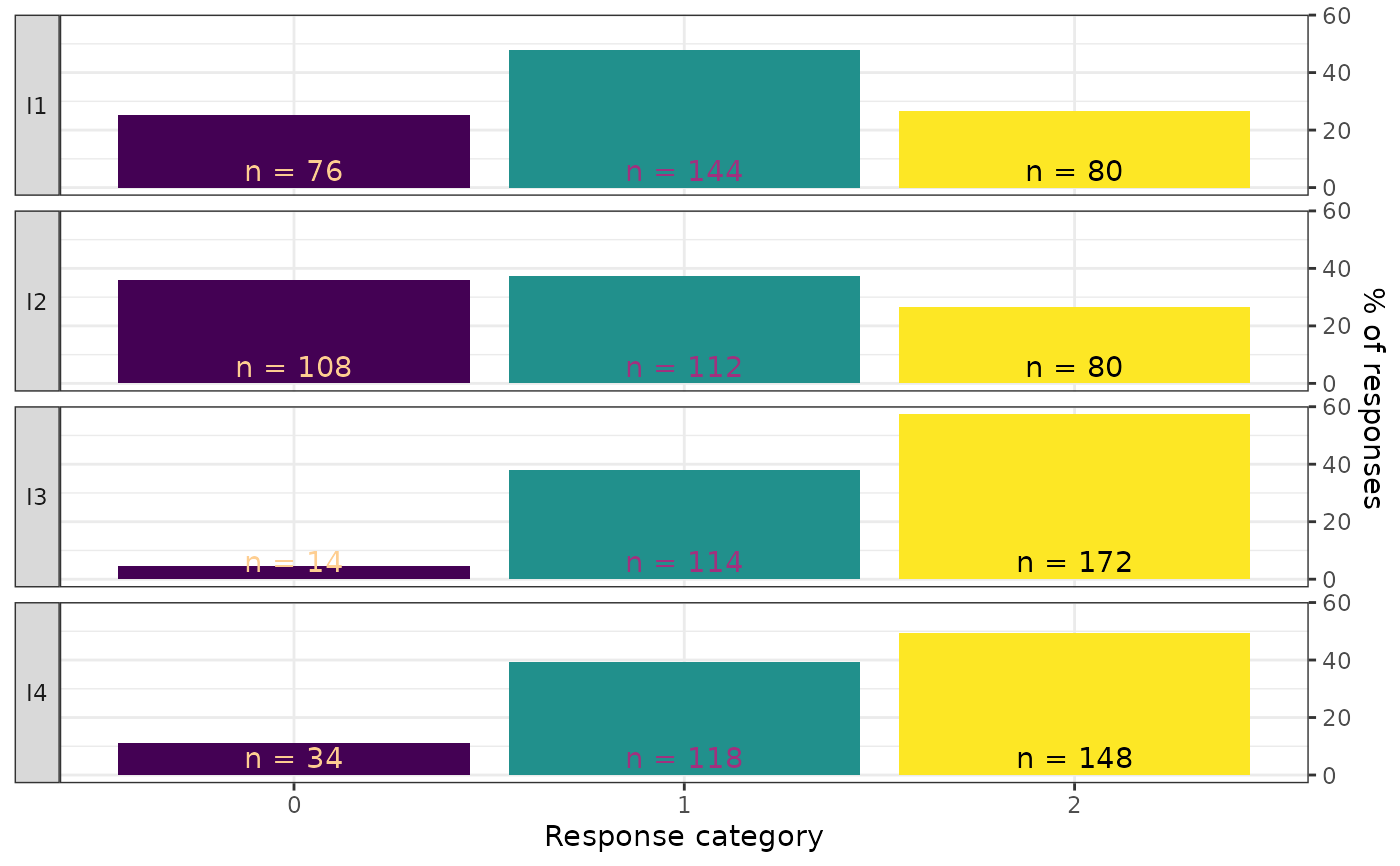
Creates a faceted bar chart showing the response distribution for each item, with counts and percentages displayed on each bar. Each item gets its own panel, with response categories on the x-axis and percentage of responses on the y-axis. This is a descriptive data visualization tool intended for use before model fitting.
Usage
plot_bars(
  data,
  item_labels = NULL,
  category_labels = NULL,
  ncol = 1,
  label_wrap = 25,
  text_y = 6,
  viridis_option = "A",
  viridis_end = 0.9,
  font = "sans"
)
Arguments
- data
A data frame in wide format containing only the item response columns. Each column is one item, each row is one person. All columns must be numeric (integer-valued). Response categories may be coded starting from 0 or 1. Do not include person IDs, grouping variables, or other non-item columns.
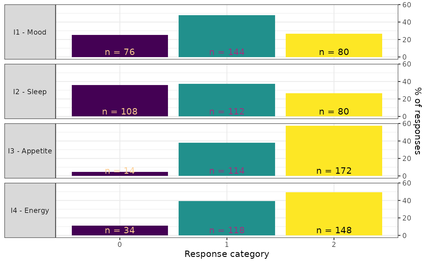
- item_labels
An optional character vector of descriptive labels for the items (facet strips). Must be the same length as
ncol(data). IfNULL(the default), column names are used. Labels are displayed as"column_name - label".- category_labels
An optional character vector of labels for the response categories (x-axis). Must be the same length as the number of response categories spanning from the minimum to the maximum observed value. If
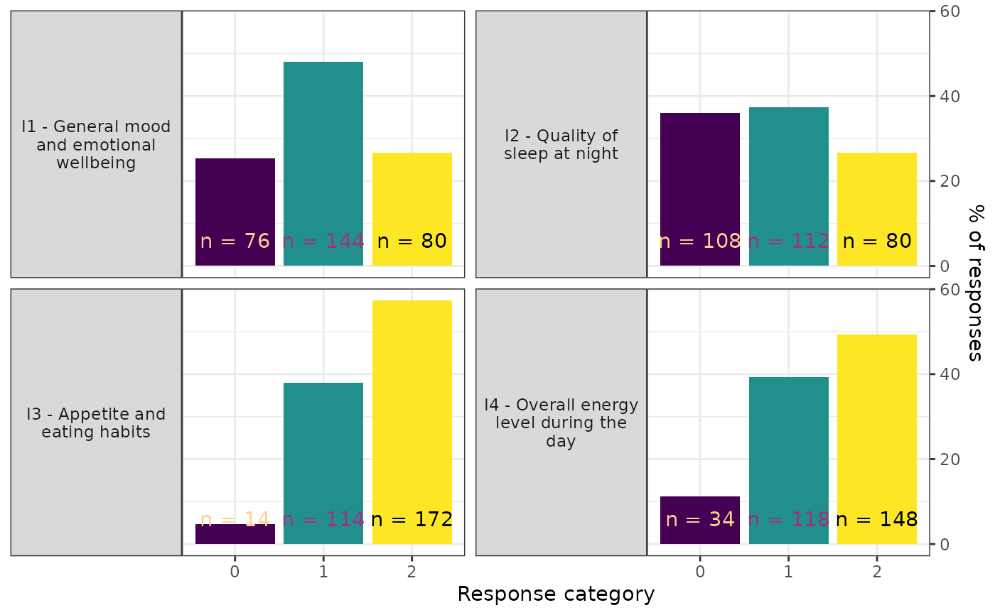
NULL(the default), numeric category values are used.- ncol
Integer. Number of columns in the faceted layout. Default is 1.
- label_wrap
Integer. Number of characters per line in facet strip labels before wrapping. Default is 25.
- text_y
Numeric. Vertical position (in percent units) for the count labels on each bar. Adjust upward if bars are tall. Default is 6.
- viridis_option
Character. Viridis palette option for the count text color. One of
"A"through"H". Default is"A".- viridis_end
Numeric in \([0, 1]\). End point of the viridis color scale for count text. Adjust if text is hard to read against the bar colors. Default is 0.9.
- font
Character. Font family for all text. Default is
"sans".
Value
A ggplot object.
Details
Each item is displayed as a separate facet panel with the item
label in the strip on the left side. Bars are colored by response
category using the viridis palette. Each bar shows the count
(n = X) as text.
Input requirements:
All columns must be numeric (integer-valued).
The data frame must contain at least 2 columns (items) and at least 1 row (person).
Examples
library(ggplot2)
if (requireNamespace("eRm", quietly = TRUE))
# Basic response distribution plot
plot_bars(eRm::pcmdat2)
 # With custom item labels
plot_bars(
eRm::pcmdat2,
item_labels = c("Mood", "Sleep", "Appetite", "Energy")
)
# With custom item labels
plot_bars(
eRm::pcmdat2,
item_labels = c("Mood", "Sleep", "Appetite", "Energy")
)
 # Two-column layout with wrapped labels
plot_bars(
eRm::pcmdat2,
item_labels = c(
"General mood and emotional wellbeing",
"Quality of sleep at night",
"Appetite and eating habits",
"Overall energy level during the day"
),
ncol = 2, label_wrap = 20
)
# Two-column layout with wrapped labels
plot_bars(
eRm::pcmdat2,
item_labels = c(
"General mood and emotional wellbeing",
"Quality of sleep at night",
"Appetite and eating habits",
"Overall energy level during the day"
),
ncol = 2, label_wrap = 20
)
 # With custom category labels
plot_bars(
eRm::pcmdat2,
category_labels = c("Never", "Sometimes", "Often")
)
# With custom category labels
plot_bars(
eRm::pcmdat2,
category_labels = c("Never", "Sometimes", "Often")
)
