Creates a tile (heat map) plot showing the distribution of responses across all items and response categories. Each cell displays the count (or percentage) of responses, with optional conditional highlighting for cells with low counts. This is a descriptive data visualization tool intended for use before model fitting.
Usage
plot_tile(
  data,
  cutoff = 10,
  highlight = TRUE,
  percent = FALSE,
  text_color = "orange",
  item_labels = NULL,
  category_labels = NULL
)
Arguments
- data
A data frame in wide format containing only the item response columns. Each column is one item, each row is one person. All columns must be numeric (integer-valued). Response categories may be coded starting from 0 or 1. Do not include person IDs, grouping variables, or other non-item columns.
- cutoff
Integer. Cells with counts below this value are highlighted (when
highlight = TRUE). Default is 10.- highlight
Logical. If
TRUE(the default), cell labels with counts belowcutoffare displayed in red. This includes cells with zero responses (empty categories), which is useful for identifying gaps in the response distribution.- percent
Logical. If
TRUE, cell labels show percentages instead of raw counts. Default isFALSE.- text_color
Character. Color for cell label text (when not highlighted). Default is
"orange".- item_labels
An optional character vector of descriptive labels for the items (y-axis). Must be the same length as
ncol(data). IfNULL(the default), column names are used.- category_labels
An optional character vector of labels for the response categories (x-axis). Must be the same length as the number of response categories spanning from the minimum to the maximum observed value. If
NULL(the default), numeric category values are used.
Value
A ggplot object.
Details
The plot displays items on the y-axis (in the same order as the
columns in data, from top to bottom) and response
categories on the x-axis. Cell shading represents the count
of responses (darker = more responses). Cell labels show either
raw counts or percentages.
Categories with zero responses are explicitly shown (as cells
with n = 0), which helps identify gaps in the response
distribution — one of the primary purposes of this plot.
Input requirements:
All columns must be numeric (integer-valued).
The data frame must contain at least 2 columns (items) and at least 1 row (person).
Examples
library(ggplot2)
if (requireNamespace("eRm", quietly = TRUE))
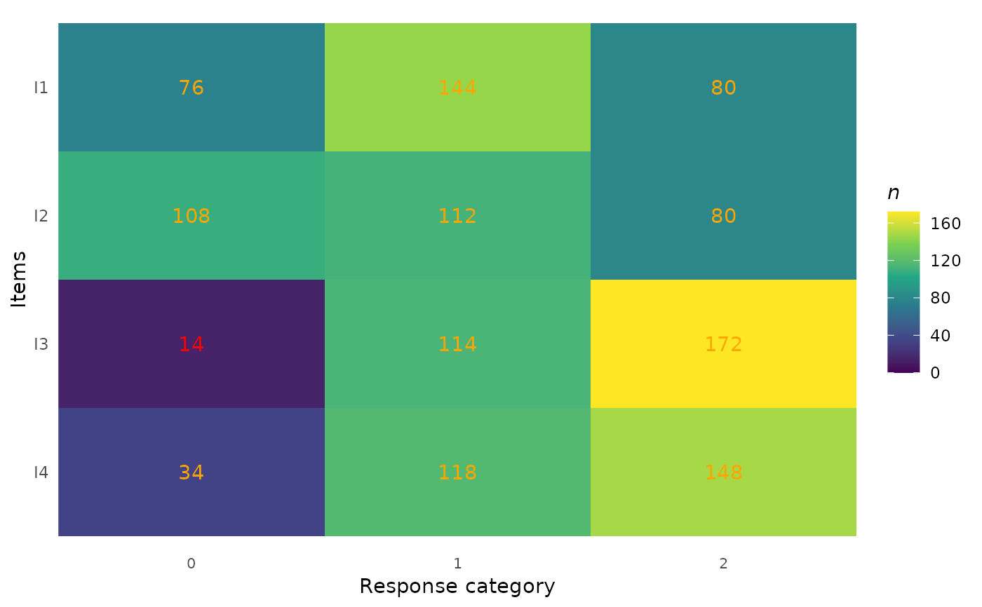
# Basic tile plot
plot_tile(eRm::pcmdat2)
 # With custom item labels
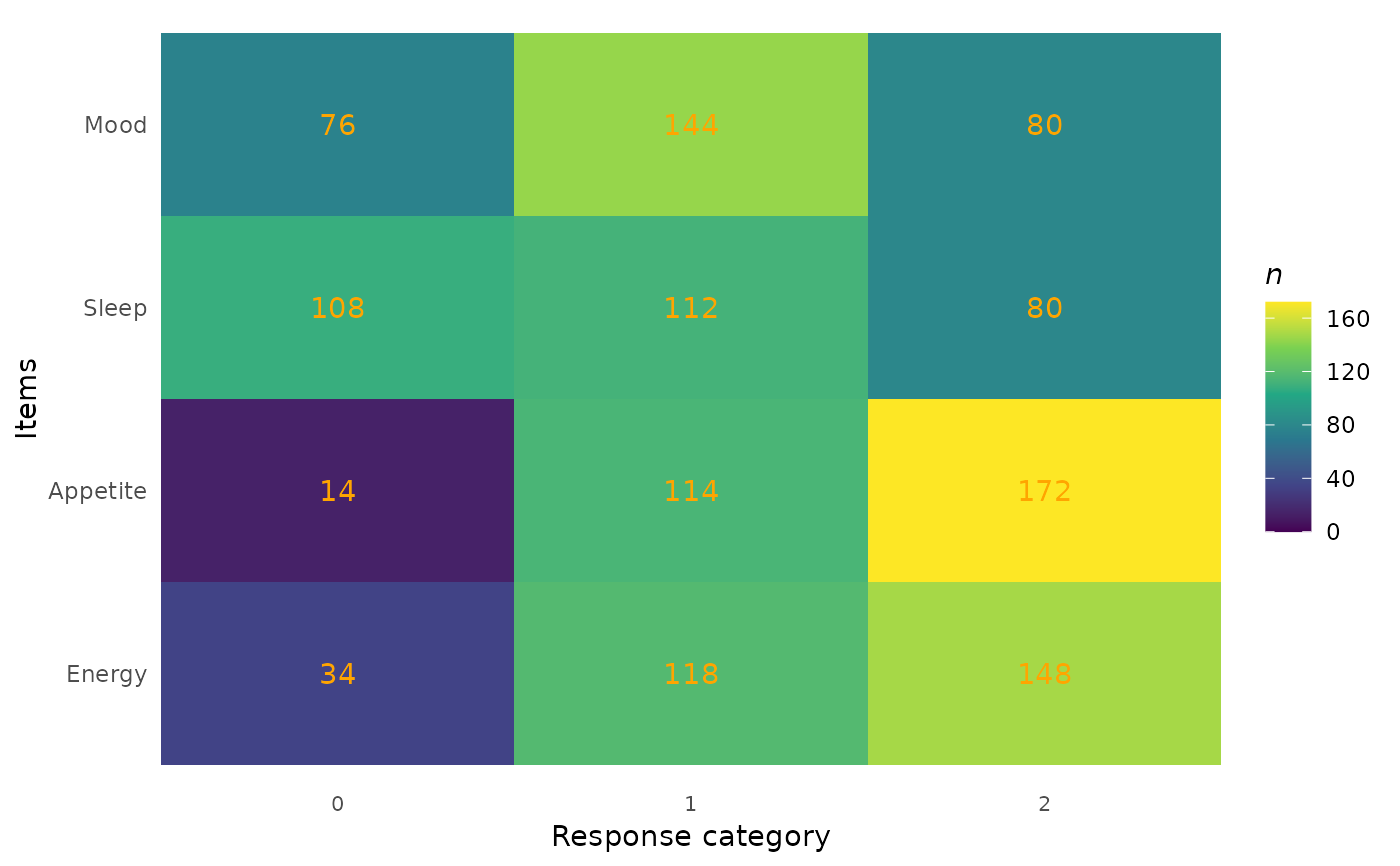
plot_tile(
eRm::pcmdat2,
item_labels = c("Mood", "Sleep", "Appetite", "Energy")
)
# With custom item labels
plot_tile(
eRm::pcmdat2,
item_labels = c("Mood", "Sleep", "Appetite", "Energy")
)
 # With custom category labels and percentages
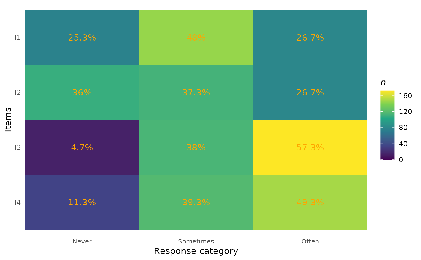
plot_tile(
eRm::pcmdat2,
category_labels = c("Never", "Sometimes", "Often"),
percent = TRUE
)
# With custom category labels and percentages
plot_tile(
eRm::pcmdat2,
category_labels = c("Never", "Sometimes", "Often"),
percent = TRUE
)
 # Adjust cutoff for highlighting
plot_tile(eRm::pcmdat2, cutoff = 20, highlight = TRUE)
# Adjust cutoff for highlighting
plot_tile(eRm::pcmdat2, cutoff = 20, highlight = TRUE)