14Förslag på visualisering och återkoppling av OSA-enkäten
Code
library(tidyverse)library(ggdist)library(ggpp)library(foreign)library(readxl)library(showtext)library(stringr)library(patchwork)library(glue)library(ggridges)library(scales)## Loading Google fonts (https://fonts.google.com/)font_add_google("Noto Sans", "noto")## Flama font with regular and italic font facesfont_add(family ="flama", regular ="../fonts/Flama-Font/Flama Regular.otf", italic ="../fonts/Flama-Font/Flama Italic.otf",bold ="../fonts/Flama-Font/FlamaBlack Regular.otf")## Automatically use showtext to render textshowtext_auto()### some commands exist in multiple packages, here we define preferred ones that are frequently usedselect <- dplyr::selectcount <- dplyr::countrecode <- car::recoderename <- dplyr::rename# file paths will need to have "../" added at the beginning to be able to render document# get itemlabelsitemlabels <-read_excel("../data/Itemlabels.xlsx") %>%filter(str_detect(itemnr, pattern ="abk|å")) %>%select(!Dimension)spssDatafil <-"2023-04-05 kl15_27 Prevent OSA-enkat.sav"# read SurveyMonkey datadf <-read.spss(spssDatafil, to.data.frame =TRUE) %>%select(starts_with("q0006"), starts_with("q0009"), q0001, q0002, q0003, q0004) %>%rename( Kön = q0002, Ålder = q0001,Bransch = q0003,Hemarbete = q0004 ) %>%na.omit()dif.kön <- df$Köndif.ålder <- df$Ålderdif.bransch <- df$Branschdif.hemarbete <- df$Hemarbetedf <- df %>%select(starts_with("q0006"), starts_with("q0009"))names(df) <- itemlabels$itemnr# read data for one index. Includes item level data and scored datadf.scored <-read.csv("../visualisering/arbkrv_recSCORED.csv") %>%select(!X)# get labels/descriptions for all items in the current domain/indexitemlabels <- itemlabels %>%filter(itemnr %in%c("abk4", "abk5", "abk6", "å2", "å4", "å5"))# add index scores to raw data, for later use when we need the actual response categoriesdf$score <- df.scored$score# vector of response categoriessvarskategorier <-c("Aldrig","Sällan","Ibland","Ganska ofta","Mycket ofta","Alltid")
14.1 Prevent tema
Kulörer, typsnitt osv - definierar återkommande layout-inställningar för figurer.
theme_prevent <-function(fontfamily ="flama", axisTitleSize =13, titlesize =15,margins =12, axisface ="plain", stripsize =12,panelDist =0.6, legendSize =9, legendTsize =10,axisTextSize =10, ...) {theme(text =element_text(family = fontfamily),axis.title.x =element_text(margin =margin(t = margins),size = axisTitleSize ),axis.title.y =element_text(margin =margin(r = margins),size = axisTitleSize ),plot.title =element_text(#family = "flama",face ="bold",size = titlesize ),axis.title =element_text(face = axisface ),axis.text =element_text(size = axisTextSize),plot.caption =element_text(face ="italic" ),legend.text =element_text(family = fontfamily, size = legendSize),legend.title =element_text(family = fontfamily, size = legendTsize),strip.text =element_text(size = stripsize),panel.spacing =unit(panelDist, "cm", data =NULL),legend.background =element_rect(color ="lightgrey"), ... )}# these rows are for specific geoms, such as geom_text() and geom_text_repel(), to match font family. Add as needed# update_geom_defaults("text", list(family = fontfamily)) +# update_geom_defaults("text_repel", list(family = fontfamily)) +# update_geom_defaults("textpath", list(family = fontfamily)) +# update_geom_defaults("texthline", list(family = fontfamily))
14.2 Gruppnivå
Nedanstående kod skapar underlag för figurerna, med sampelstorlek 7, 20 och 40.
Code
# create vector with possible values, which needs to be connected to the transformation table# ordinal -> interval# "score" is interval levelpossible <- df.scored %>%# maybe rewrite this to just make the dataframe belowdistinct(score) %>%arrange(score) %>%pull(score)# make a dataframe with possible values and a count variable (n) with missing datadf.possible <- possible %>%as.data.frame(nm ="score") %>%add_column(n =NA)sampleSmall <-7sampleMed <-20sampleLarge <-40set.seed(1337)
Code
# pick random sample to use for visualization exampledf.test7 <- df.scored %>%slice_sample(n = sampleSmall) %>%add_column(group ="Mättillfälle 1")# get another sample for examples comparing two measurementsdf.test7b <- df.scored %>%slice_sample(n = sampleSmall) %>%add_column(group ="Mättillfälle 2")# combine datadf.compare7 <-rbind(df.test7, df.test7b)#### pick random sample to use for visualization exampledf.test20 <- df.scored %>%slice_sample(n = sampleMed) %>%add_column(group ="Mättillfälle 1")# get another sample for examples comparing two measurementsdf.test20b <- df.scored %>%slice_sample(n = sampleMed) %>%add_column(group ="Mättillfälle 2")# combine datadf.compare20 <-rbind(df.test20, df.test20b)#### pick random sample to use for visualization exampledf.test40 <- df.scored %>%slice_sample(n = sampleLarge) %>%add_column(group ="Mättillfälle 1")# get another sample for examples comparing two measurementsdf.test40b <- df.scored %>%slice_sample(n = sampleLarge) %>%add_column(group ="Mättillfälle 2")# combine datadf.compare40 <-rbind(df.test40, df.test40b)
Code
# create a dataframe with frequency counts of estimated scores, to use for size/colordf.counts7 <- df.test7 %>%count(score) %>%right_join(df.possible, # fill in with all scores possibleby ="score" ) %>%arrange(score) %>%select(!n.y) %>%rename(n = n.x) %>%mutate(N =case_when( # change missing to 1 and multiply other frequencies by 2is.na(n) ~1,TRUE~ n *2 )) %>%mutate(nFactor =factor(n)) # make a categorical variable with counts# calculate 90% confidence interval for the test samplesmallSample90ci <-sd(df.test7$score) / (sqrt(length(df.test7$score))) *1.65smallSample90ci2 <-sd(df.test7b$score) / (sqrt(length(df.test7b$score))) *1.65###### create a dataframe with frequency counts of estimated scores, to use for size/colordf.counts20 <- df.test20 %>%count(score) %>%right_join(df.possible, # fill in with all scores possibleby ="score" ) %>%arrange(score) %>%select(!n.y) %>%rename(n = n.x) %>%mutate(N =case_when( # change missing to 1 and multiply other frequencies by 2is.na(n) ~1,TRUE~ n *2 )) %>%mutate(nFactor =factor(n)) # make a categorical variable with counts# calculate 90% confidence interval for the test samplemedSample90ci <-sd(df.test20$score) / (sqrt(length(df.test20$score))) *1.65medSample90ci2 <-sd(df.test20b$score) / (sqrt(length(df.test20b$score))) *1.65###### create a dataframe with frequency counts of estimated scores, to use for size/colordf.counts40 <- df.test40 %>%count(score) %>%right_join(df.possible, # fill in with all scores possibleby ="score" ) %>%arrange(score) %>%select(!n.y) %>%rename(n = n.x) %>%mutate(N =case_when( # change missing to 1 and multiply other frequencies by 2is.na(n) ~1,TRUE~ n *2 )) %>%mutate(nFactor =factor(n)) # make a categorical variable with counts# calculate 90% confidence interval for the test samplelargeSample90ci <-sd(df.test40$score) / (sqrt(length(df.test40$score))) *1.65largeSample90ci2 <-sd(df.test40b$score) / (sqrt(length(df.test40b$score))) *1.65
Code
# for comparison of 2 measurementsdf.countsComp7 <- df.compare7 %>%group_by(group) %>%count(score) %>%right_join(df.possible, # fill in with all scores possibleby ="score" ) %>%arrange(score) %>%select(!n.y) %>%rename(n = n.x) %>%mutate(N =case_when( # change missing to 1 and multiply other frequencies by 2is.na(n) ~1,TRUE~ n *2 )) %>%mutate(nFactor =factor(n)) # make a categorical variable with counts# for comparison of 2 measurementsdf.countsComp20 <- df.compare20 %>%group_by(group) %>%count(score) %>%right_join(df.possible, # fill in with all scores possibleby ="score" ) %>%arrange(score) %>%select(!n.y) %>%rename(n = n.x) %>%mutate(N =case_when( # change missing to 1 and multiply other frequencies by 2is.na(n) ~1,TRUE~ n *2 )) %>%mutate(nFactor =factor(n)) # make a categorical variable with counts# for comparison of 2 measurementsdf.countsComp40 <- df.compare40 %>%group_by(group) %>%count(score) %>%right_join(df.possible, # fill in with all scores possibleby ="score" ) %>%arrange(score) %>%select(!n.y) %>%rename(n = n.x) %>%mutate(N =case_when( # change missing to 1 and multiply other frequencies by 2is.na(n) ~1,TRUE~ n *2 )) %>%mutate(nFactor =factor(n)) # make a categorical variable with counts
14.3 Visualisering av ett område/index
Vi kommer antagligen att vilja ta fram en vy som ger en överblick, där resultat på samtliga områden visas under varandra. Som ett första steg tar vi fram förslag på hur ett enskild index kan visas, och i nästa steg hur vi visualiserar svaren på de frågor/items som ingår i ett index, eller på frågor som inte kan bilda ett index.
14.3.1 Förslag 1
Detta ser kanske något suboptimalt ut när det bara är ett index (eller en grupp/mätning) som visualiseras.
Tanken är att det ska synas (diskret) vilka möjliga mätvärden som finns, för att ge referenspunkter utan att ha värden på x-axeln. Detta blir mera pedagogiskt kanske om det skulle finnas en indikation på medel/SD för någon referensgrupp.
Färgade prickar indikerar svarsfördelningen, där både storlek och färg påverkas av antalet individer som har samma mätvärde.
“Diamanten” visar medelvärdet (eftersom detta är mätvärden på intervallnivå), och de horisontala strecken visar 90% konfidensintervall. Detta eftersom det ger ett seriöst sätt att göra jämförelser. Om man har två mätningar och deras 90%CI inte överlappar är det en signifikant skillnad.
# testing a plot of "empty" circles, filled with color gradient based on density/frequency of responseggplot() +# plot possible values as hollow circlesgeom_point(data = df.counts20,aes(x = score, y =1),size =3,shape =1,color ="grey",alpha =0.7 ) +# plot actual scores in data sample as filled circles, with gradient based on frequency(?)geom_point(data =na.omit(df.counts20), # remove missing data to remove NA from legendaes(x = score, y =1, size = n *1.5, color = nFactor),# size = 3,shape =16 ) +### plot 95% confidence interval around the mean# segment makes a line# geom_segment(data = df.test,# aes(x = mean(score) - sample90ci,# xend = mean(score) + sample90ci,# y = 0.95, yend = 0.95),# color = "darkgrey"# ) +# errorbar has brackets at the endpoints# geom_errorbar(# data = df.test,# aes(# xmin = mean(score) - sample90ci,# xmax = mean(score) + sample90ci,# y = 0.95,# width = 0.025# ),# color = "darkgrey"# ) +# plot mean/median and some sort of distribution (SD/SE?) to make it easier to compare over timegeom_point(data = df.test20,aes(x =mean(score), y =0.95),size =7,shape =18,color ="black" ) +### graphing properties belowcoord_cartesian(ylim =c(0.8, 1.2), # limits for x and y axisxlim =c(-3, 4) ) +scale_size_continuous(range =c(5, 10), # set minimum and maximum point sizeguide ="none" ) +# remove legend for size aesthetic### theming, colors, fonts, etc belowtheme_minimal() +theme_prevent() +scale_color_viridis_d("Antal svar",begin =0.2 ) +# scale_color_manual(values = PREVENTpalette1) +labs(title ="Förslag 1",subtitle ="Värden längre till höger är bättre",caption ="Svart diamant indikerar medelvärde.\nTomma ringar indikerar möjliga mätvärden.",y ="",x ="" ) +theme(axis.text.x =element_blank(), # remove text from both axesaxis.text.y =element_blank(),axis.title =element_blank() ) +scale_y_continuous(minor_breaks =NULL) +guides(color =guide_legend(override.aes =list(size =7))) # make points in legend bigger
Code
# testing a plot of "empty" circles, filled with color gradient based on density/frequency of responseggplot() +# plot possible values as hollow circlesgeom_point(data = df.counts7,aes(x = score, y =1),size =3,shape =1,color ="grey",alpha =0.7 ) +# plot actual scores in data sample as filled circles, with gradient based on frequency(?)geom_point(data =na.omit(df.counts7), # remove missing data to remove NA from legendaes(x = score, y =1, size = n *1.5, color = nFactor),# size = 3,shape =16 ) +### plot 95% confidence interval around the mean# segment makes a line# geom_segment(data = df.test,# aes(x = mean(score) - sample90ci,# xend = mean(score) + sample90ci,# y = 0.95, yend = 0.95),# color = "darkgrey"# ) +# errorbar has brackets at the endpoints# geom_errorbar(# data = df.test,# aes(# xmin = mean(score) - sample90ci,# xmax = mean(score) + sample90ci,# y = 0.95,# width = 0.025# ),# color = "darkgrey"# ) +# plot mean/median and some sort of distribution (SD/SE?) to make it easier to compare over timegeom_point(data = df.test7,aes(x =mean(score), y =0.95),size =7,shape =18,color ="black" ) +### graphing properties belowcoord_cartesian(ylim =c(0.8, 1.2), # limits for x and y axisxlim =c(-3, 4) ) +scale_size_continuous(range =c(5, 10), # set minimum and maximum point sizeguide ="none" ) +# remove legend for size aesthetic### theming, colors, fonts, etc belowtheme_minimal() +theme_prevent() +scale_color_viridis_d("Antal svar",begin =0.2 ) +# scale_color_manual(values = PREVENTpalette1) +labs(title ="Förslag 1",subtitle ="Värden längre till höger är bättre",caption ="Svart diamant indikerar medelvärde.",y ="",x ="" ) +theme(axis.text.x =element_blank(), # remove text from both axesaxis.text.y =element_blank(),axis.title =element_blank() ) +scale_y_continuous(minor_breaks =NULL) +guides(color =guide_legend(override.aes =list(size =7))) # make points in legend bigger
Code
# testing a plot of "empty" circles, filled with color gradient based on density/frequency of responseggplot() +# plot possible values as hollow circlesgeom_point(data = df.counts40,aes(x = score, y =1),size =3,shape =1,color ="grey",alpha =0.7 ) +# plot actual scores in data sample as filled circles, with gradient based on frequency(?)geom_point(data =na.omit(df.counts40), # remove missing data to remove NA from legendaes(x = score, y =1, size = n *1.5, color = nFactor),# size = 3,shape =16 ) +### plot 95% confidence interval around the mean# segment makes a line# geom_segment(data = df.test,# aes(x = mean(score) - sample90ci,# xend = mean(score) + sample90ci,# y = 0.95, yend = 0.95),# color = "darkgrey"# ) +# errorbar has brackets at the endpoints# geom_errorbar(# data = df.test,# aes(# xmin = mean(score) - sample90ci,# xmax = mean(score) + sample90ci,# y = 0.95,# width = 0.025# ),# color = "darkgrey"# ) +# plot mean/median and some sort of distribution (SD/SE?) to make it easier to compare over timegeom_point(data = df.test40,aes(x =mean(score), y =0.95),size =7,shape =18,color ="black" ) +### graphing properties belowcoord_cartesian(ylim =c(0.8, 1.2), # limits for x and y axisxlim =c(-3, 4) ) +scale_size_continuous(range =c(5, 10), # set minimum and maximum point sizeguide ="none" ) +# remove legend for size aesthetic### theming, colors, fonts, etc belowtheme_minimal() +theme_prevent() +scale_color_viridis_d("Antal svar",begin =0.2 ) +# scale_color_manual(values = PREVENTpalette1) +labs(title ="Förslag 1",subtitle ="Värden längre till höger är bättre",caption ="Svart diamant indikerar medelvärde.",y ="",x ="" ) +theme(axis.text.x =element_blank(), # remove text from both axesaxis.text.y =element_blank(),axis.title =element_blank() ) +scale_y_continuous(minor_breaks =NULL) +guides(color =guide_legend(override.aes =list(size =7))) # make points in legend bigger
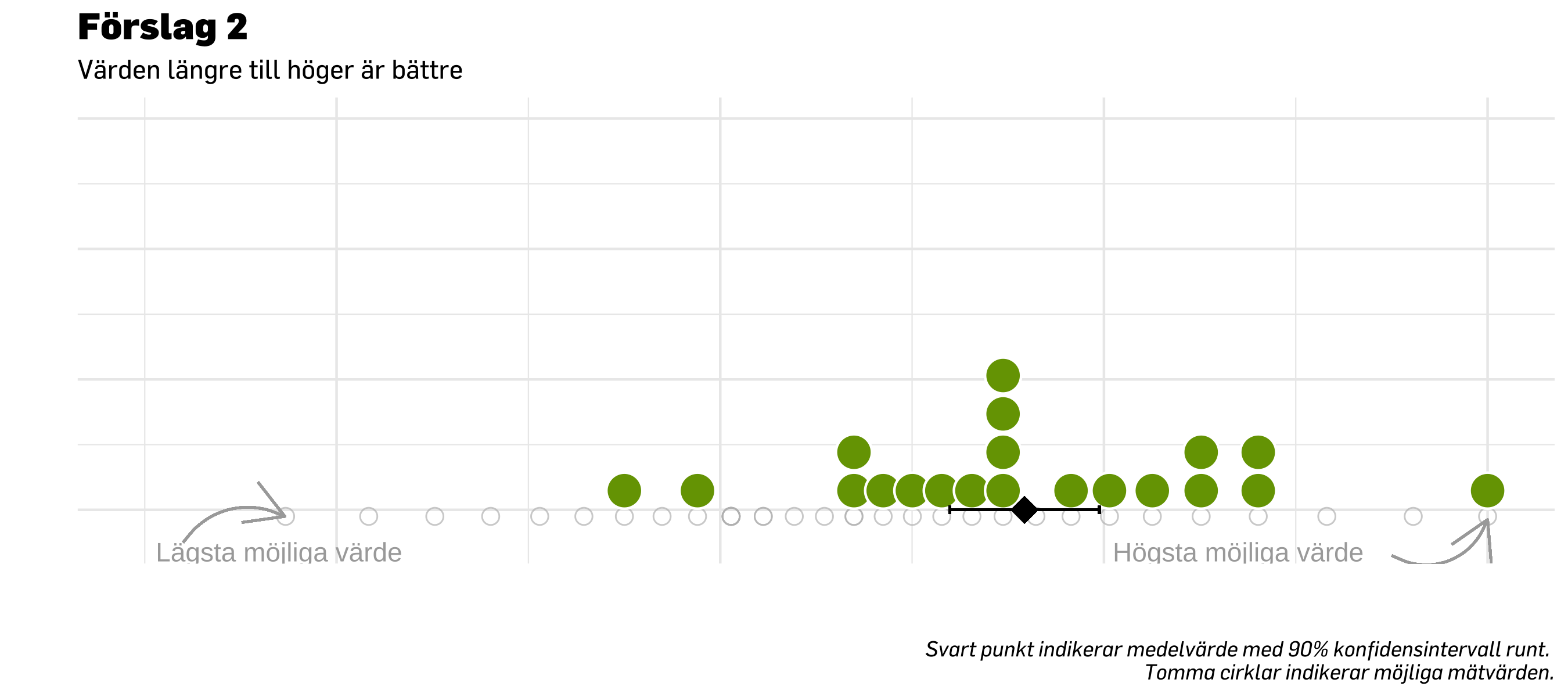
14.3.2 Förslag 2
Detta ser kanske något suboptimalt ut när det bara är ett index (eller en grupp/mätning) som visualiseras.
En möjlighet med stat_dots är att lägga till ett lager som visar en jämförande mätning med dotplot som går nedåt (spegelvänt runt samma linje), i en annan kulör.
ggplot( df.test20,aes(x = score, y =0)) +geom_point(data = df.counts20,aes(x = score, y =-0.02, fill =NULL),size =3,shape =1,color ="grey",alpha =0.7 ) +stat_dots(side ="top",scale =0.3,show.legend = F,position =position_dodge(width = .9),color ="white",alpha =1,# verbose = T,binwidth =0.1, # this and the one below may need to be calculated from data insteadfill = prevent_light_green,dotsize =2 ) +# plot meangeom_point(aes(x =mean(score),y =0 ),size =5,shape =18,color ="black" ) +### graphing properties belowcoord_cartesian(ylim =c(-0.1, 1.2), # limits for x and y axisxlim =c(-3, 4) ) +scale_size_continuous(range =c(5, 10), # set minimum and maximum point sizeguide ="none" ) +# remove legend for size aesthetic### theming, colors, fonts, etc belowtheme_minimal() +theme_prevent() +labs(title ="Förslag 2",subtitle ="Värden längre till höger är bättre",caption ="Svart punkt indikerar medelvärde. Tomma cirklar indikerar möjliga mätvärden.",y ="",x ="" ) +annotate("text", x =2.7, y =-0.13, label ="Högsta möjliga värde",color ="darkgrey") +geom_curve(x =3.5, y =-0.14,xend =4, yend =-0.03,color ="darkgrey",#curvature = -0.4,arrow =arrow() ) +annotate("text", x =-2.3, y =-0.13, label ="Lägsta möjliga värde",color ="darkgrey") +geom_curve(x =-2.8, y =-0.1,xend =-2.27, yend =-0.02, # xend = lägsta värdet i `df.counts20`color ="darkgrey",curvature =-0.4,arrow =arrow() ) +theme(axis.text.x =element_blank(), # remove text from both axesaxis.text.y =element_blank(),axis.title =element_blank(), ) +guides(color =guide_legend(override.aes =list(size =7))) # make points in legend bigger
Code
ggplot( df.test20,aes(x = score, y =0) # y is arbitrary to just have a baseline when only visualizing one domain/index) +# plot possible response values as empty circlesgeom_point(data = df.counts20,aes(x = score, y =-0.02, fill =NULL),size =3,shape =1,color ="grey",alpha =0.7 ) +# plot distribution of actual response valuesstat_dots(side ="top",scale =0.3,show.legend = F,position =position_dodge(width = .9),color ="white",alpha =1,# verbose = T,binwidth =0.1, # this and the one below may need to be calculated from data insteadfill = prevent_light_green,dotsize =2 ) +# errorbar has brackets at the endpointsgeom_errorbar(aes(xmin =mean(score) - medSample90ci,xmax =mean(score) + medSample90ci,y =0,width =0.025 ),color ="black" ) +# plot meangeom_point(aes(x =mean(score),y =0 ),size =5,shape =18,color ="black" ) +### graphing properties belowcoord_cartesian(ylim =c(-0.1, 1.2), # limits for x and y axisxlim =c(-3, 4) ) +scale_size_continuous(range =c(5, 10), # set minimum and maximum point sizeguide ="none" ) +# remove legend for size aesthetic### theming, colors, fonts, etc belowtheme_minimal() +theme_prevent() +labs(title ="Förslag 2",subtitle ="Värden längre till höger är bättre",caption ="Svart punkt indikerar medelvärde med 90% konfidensintervall runt. Tomma cirklar indikerar möjliga mätvärden.",y ="",x ="" ) +annotate("text", x =2.7, y =-0.13, label ="Högsta möjliga värde",color ="darkgrey") +geom_curve(x =3.5, y =-0.14,xend =4, yend =-0.03,color ="darkgrey",#curvature = -0.4,arrow =arrow() ) +annotate("text", x =-2.3, y =-0.13, label ="Lägsta möjliga värde",color ="darkgrey") +geom_curve(x =-2.8, y =-0.1,xend =-2.27, yend =-0.02, # xend = lägsta värdet i `df.counts20`color ="darkgrey",curvature =-0.4,arrow =arrow() ) +theme(axis.text.x =element_blank(), # remove text from both axesaxis.text.y =element_blank(),axis.title =element_blank(), ) +guides(color =guide_legend(override.aes =list(size =7))) # make points in legend bigger
Code
ggplot( df.test7,aes(x = score, y =0)) +# stat_slab(# side = "right", show.legend = F,# scale = 0.6, # defines the height that a slab can reach# position = position_dodge(width = .6), # distance between elements for dodging# aes(fill_ramp = after_stat(level), fill = group),# .width = c(.50, .75, 1)# ) +geom_point(data = df.counts7,aes(x = score, y =-0.02, fill =NULL),size =3,shape =1,color ="grey",alpha =0.7 ) +stat_dots(side ="top",scale =0.3,show.legend = F,position =position_dodge(width = .9),color ="white",alpha =1,# verbose = T,binwidth =0.1, # this and the one below may need to be calculated from data insteadfill = prevent_light_green,dotsize =2 ) +# errorbar has brackets at the endpoints# geom_errorbar(# aes(# xmin = mean(score) - smallSample90ci,# xmax = mean(score) + smallSample90ci,# y = 0,# width = 0.025# ),# color = "black"# ) +# plot mean/median and some sort of distribution (SD/SE?) to make it easier to compare over timegeom_point(aes(x =mean(score),y =0 ),size =5,shape =18,color ="black" ) +### graphing properties belowcoord_cartesian(ylim =c(-0.1, 1.2), # limits for x and y axisxlim =c(-3, 4) ) +scale_size_continuous(range =c(5, 10), # set minimum and maximum point sizeguide ="none" ) +# remove legend for size aesthetic### theming, colors, fonts, etc belowtheme_minimal() +theme_prevent() +# scale_color_viridis_d(# guide = "none",# begin = 0.6,# aesthetics = c("fill", "color"),# direction = 1# ) +labs(title ="Förslag 2",subtitle ="Värden längre till höger är bättre",caption ="Svart punkt indikerar medelvärde.",y ="",x ="" ) +theme(axis.text.x =element_blank(), # remove text from both axesaxis.text.y =element_blank(),axis.title =element_blank(), ) +guides(color =guide_legend(override.aes =list(size =7))) # make points in legend bigger
Code
ggplot( df.test40,aes(x = score, y =0)) +# stat_slab(# side = "right", show.legend = F,# scale = 0.6, # defines the height that a slab can reach# position = position_dodge(width = .6), # distance between elements for dodging# aes(fill_ramp = after_stat(level), fill = group),# .width = c(.50, .75, 1)# ) +geom_point(data = df.counts40,aes(x = score, y =-0.02, fill =NULL),size =3,shape =1,color ="grey",alpha =0.7 ) +stat_dots(side ="top",scale =0.3,show.legend = F,position =position_dodge(width = .9),color ="white",alpha =1,# verbose = T,binwidth =0.1, # this and the one below may need to be calculated from data insteadfill = prevent_light_green,dotsize =2 ) +# errorbar has brackets at the endpoints# geom_errorbar(# aes(# xmin = mean(score) - smallSample90ci,# xmax = mean(score) + smallSample90ci,# y = 0,# width = 0.025# ),# color = "black"# ) +# plot mean/median and some sort of distribution (SD/SE?) to make it easier to compare over timegeom_point(aes(x =mean(score),y =0 ),size =5,shape =18,color ="black" ) +### graphing properties belowcoord_cartesian(ylim =c(-0.1, 1.2), # limits for x and y axisxlim =c(-3, 4) ) +scale_size_continuous(range =c(5, 10), # set minimum and maximum point sizeguide ="none" ) +# remove legend for size aesthetic### theming, colors, fonts, etc belowtheme_minimal() +theme_prevent() +# scale_color_viridis_d(# guide = "none",# begin = 0.6,# aesthetics = c("fill", "color"),# direction = 1# ) +labs(title ="Förslag 2",subtitle ="Värden längre till höger är bättre",caption ="Svart punkt indikerar medelvärde.",y ="",x ="" ) +theme(axis.text.x =element_blank(), # remove text from both axesaxis.text.y =element_blank(),axis.title =element_blank(), ) +guides(color =guide_legend(override.aes =list(size =7))) # make points in legend bigger
ggplot( df.compare20,aes(x = score, y = group, fill = group)) +stat_dots(side ="top",scale =0.3,show.legend = F,position =position_dodge(width = .9),color ="white",alpha =0.8,# verbose = T,binwidth =0.1, # this and the one below may need to be calculated from data insteaddotsize =2 ) +# plot mean (point) and confidence interval (error bar) to make it easier to compare over timegeom_errorbar(data = df.compare20 %>%filter(group =="Mättillfälle 1"),aes(xmin =mean(score) - medSample90ci,xmax =mean(score) + medSample90ci,y = group,width =0.1 ),color ="black" ) +geom_point(data = df.compare20 %>%filter(group =="Mättillfälle 1"),aes(x =mean(score),y = group ),size =5,shape =18,color ="black" ) +geom_errorbar(data = df.compare20 %>%filter(group =="Mättillfälle 2"),aes(xmin =mean(score) - medSample90ci2,xmax =mean(score) + medSample90ci2,y = group,width =0.1 ),color ="black" ) +geom_point(data = df.compare20 %>%filter(group =="Mättillfälle 2"),aes(x =mean(score),y = group ),size =5,shape =18,color ="black" ) +### graphing properties belowcoord_cartesian(# ylim = c(0, 1.2), # limits for x and y axisxlim =c(-3, 4) ) +scale_size_continuous(range =c(5, 10), # set minimum and maximum point sizeguide ="none" ) +# remove legend for size aesthetic### theming, colors, fonts, etc belowtheme_minimal(base_family ="noto") +theme_prevent() +scale_color_manual(values =c(prevent_light_blue,prevent_yellow),aesthetics =c("fill", "color"),guide ="none" ) +# scale_color_manual(values = PREVENTpalette1) +labs(title ="Förslag 2",subtitle ="Värden längre till höger är bättre",caption ="Svart punkt indikerar medelvärde med 90% konfidensintervall runt.",y ="",x ="" ) +theme(axis.text.x =element_blank(), # remove text from x axisaxis.title =element_blank(), ) +guides(color =guide_legend(override.aes =list(size =7))) # make points in legend bigger
Code
ggplot( df.compare7,aes(x = score, y = group, fill = group)) +# stat_slab(# side = "right", show.legend = F,# scale = 0.6, # defines the height that a slab can reach# position = position_dodge(width = .6), # distance between elements for dodging# aes(fill_ramp = after_stat(level), fill = group),# .width = c(.50, .75, 1)# ) +stat_dots(side ="top",scale =0.3,show.legend = F,position =position_dodge(width = .9),color ="white",alpha =0.8,# verbose = T,binwidth =0.1, # this and the one below may need to be calculated from data insteaddotsize =2 ) +# errorbar has brackets at the endpointsgeom_errorbar(data = df.compare7 %>%filter(group =="Mättillfälle 1"),aes(xmin =mean(score) - smallSample90ci,xmax =mean(score) + smallSample90ci,y = group,width =0.1 ),color ="black" ) +# plot mean/median and some sort of distribution (SD/SE?) to make it easier to compare over timegeom_point(data = df.compare7 %>%filter(group =="Mättillfälle 1"),aes(x =mean(score),y = group ),size =5,shape =18,color ="black" ) +geom_errorbar(data = df.compare7 %>%filter(group =="Mättillfälle 2"),aes(xmin =mean(score) - smallSample90ci2,xmax =mean(score) + smallSample90ci2,y = group,width =0.1 ),color ="black" ) +# plot mean/median and some sort of distribution (SD/SE?) to make it easier to compare over timegeom_point(data = df.compare7 %>%filter(group =="Mättillfälle 2"),aes(x =mean(score),y = group ),size =5,shape =18,color ="black" ) +### graphing properties belowcoord_cartesian(# ylim = c(0, 1.2), # limits for x and y axisxlim =c(-3, 4) ) +scale_size_continuous(range =c(5, 10), # set minimum and maximum point sizeguide ="none" ) +# remove legend for size aesthetic### theming, colors, fonts, etc belowtheme_minimal(base_family ="noto") +theme_prevent() +scale_color_manual(values =c(prevent_light_blue,prevent_yellow),aesthetics =c("fill", "color"),guide ="none" ) +# scale_color_manual(values = PREVENTpalette1) +labs(title ="Förslag 2",subtitle ="Värden längre till höger är bättre",caption ="Svart punkt indikerar medelvärde med 90% konfidensintervall runt.",y ="",x ="" ) +theme(axis.text.x =element_blank(), # remove text from both axesaxis.title =element_blank(), ) +guides(color =guide_legend(override.aes =list(size =7))) # make points in legend bigger
Code
ggplot( df.compare40,aes(x = score, y = group, fill = group)) +# stat_slab(# side = "right", show.legend = F,# scale = 0.6, # defines the height that a slab can reach# position = position_dodge(width = .6), # distance between elements for dodging# aes(fill_ramp = after_stat(level), fill = group),# .width = c(.50, .75, 1)# ) +stat_dots(side ="top",scale =0.3,show.legend = F,position =position_dodge(width = .9),color ="white",alpha =0.8,# verbose = T,binwidth =0.1, # this and the one below may need to be calculated from data insteaddotsize =2 ) +# errorbar has brackets at the endpointsgeom_errorbar(data = df.compare40 %>%filter(group =="Mättillfälle 1"),aes(xmin =mean(score) - largeSample90ci,xmax =mean(score) + largeSample90ci,y = group,width =0.1 ),color ="black" ) +# plot mean/median and some sort of distribution (SD/SE?) to make it easier to compare over timegeom_point(data = df.compare40 %>%filter(group =="Mättillfälle 1"),aes(x =mean(score),y = group ),size =5,shape =18,color ="black" ) +geom_errorbar(data = df.compare40 %>%filter(group =="Mättillfälle 2"),aes(xmin =mean(score) - largeSample90ci2,xmax =mean(score) + largeSample90ci2,y = group,width =0.1 ),color ="black" ) +# plot mean/median and some sort of distribution (SD/SE?) to make it easier to compare over timegeom_point(data = df.compare40 %>%filter(group =="Mättillfälle 2"),aes(x =mean(score),y = group ),size =5,shape =18,color ="black" ) +### graphing properties belowcoord_cartesian(# ylim = c(0, 1.2), # limits for x and y axisxlim =c(-3, 4) ) +scale_size_continuous(range =c(5, 10), # set minimum and maximum point sizeguide ="none" ) +# remove legend for size aesthetic### theming, colors, fonts, etc belowtheme_minimal(base_family ="noto") +theme_prevent() +scale_color_manual(values =c(prevent_light_blue,prevent_yellow),aesthetics =c("fill", "color"),guide ="none" ) +# scale_color_manual(values = PREVENTpalette1) +labs(title ="Förslag 2",subtitle ="Värden längre till höger är bättre",caption ="Svart punkt indikerar medelvärde med 90% konfidensintervall runt.",y ="",x ="" ) +theme(axis.text.x =element_blank(), # remove text from both axesaxis.title =element_blank(), ) +guides(color =guide_legend(override.aes =list(size =7))) # make points in legend bigger
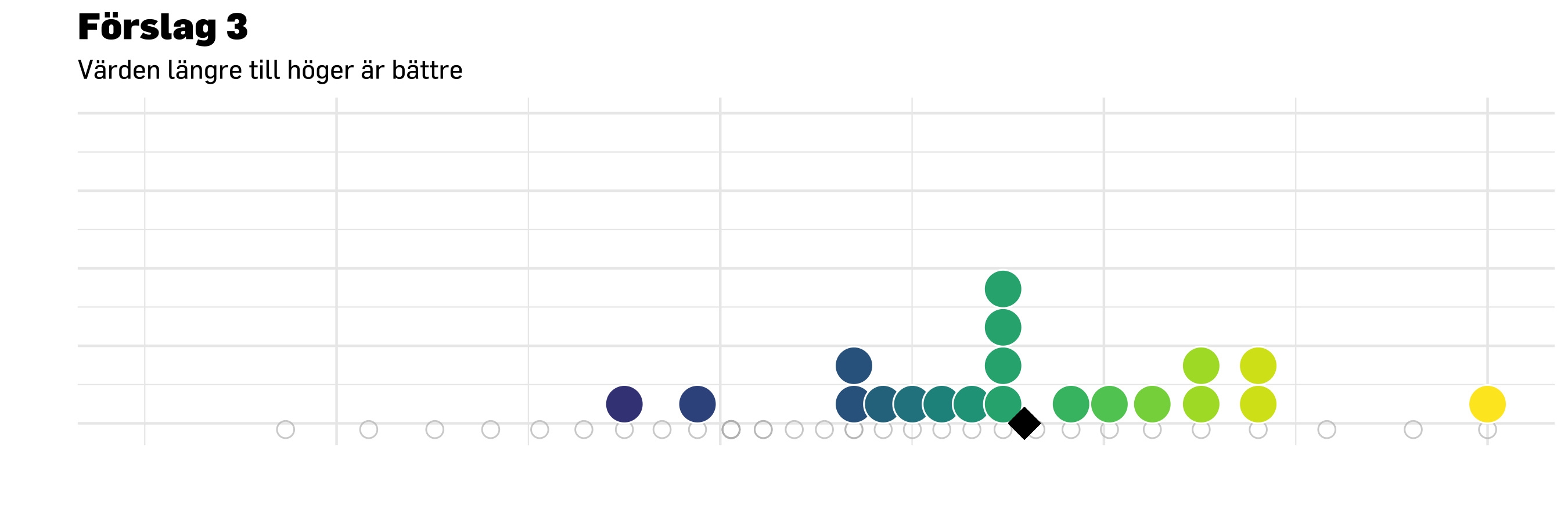
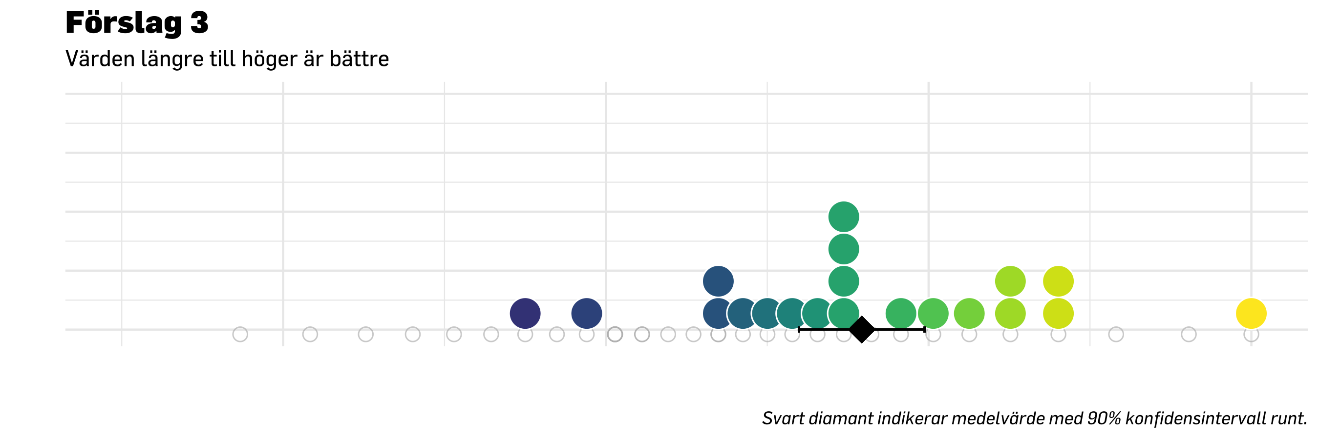
nudge <-0.3ggplot( df.compare20,aes(x = score, y =0.5, fill = group)) +# stat_slab(# side = "right", show.legend = F,# scale = 0.6, # defines the height that a slab can reach# position = position_dodge(width = .6), # distance between elements for dodging# aes(fill_ramp = after_stat(level), fill = group),# .width = c(.50, .75, 1)# ) +stat_dots(data = df.compare20 %>%filter(group =="Mättillfälle 1"),side ="top",scale =0.3,show.legend = T,position =position_dodge(width = .9),alpha =0.66,# verbose = T,binwidth =0.1, # this and the one below may need to be calculated from data insteaddotsize =2,color ="white" ) +stat_dots(data = df.compare20 %>%filter(group =="Mättillfälle 2"),side ="bottom",scale =0.3,show.legend = F,position =position_dodge(width = .9),alpha =0.66,# verbose = T,binwidth =0.1, # this and the one below may need to be calculated from data insteaddotsize =2,color ="white" ) +# errorbar has brackets at the endpointsgeom_errorbar(data = df.compare20 %>%filter(group =="Mättillfälle 2"),aes(xmin =mean(score) - medSample90ci2,xmax =mean(score) + medSample90ci2,y =0.5,width =0.025,color = group ),position =position_nudge(y =-nudge) ) +# plot mean/median and some sort of distribution (SD/SE?) to make it easier to compare over timegeom_point(data = df.compare20 %>%filter(group =="Mättillfälle 2"),aes(x =mean(score),y =0.5,color = group ),size =5,shape =18,position =position_nudge(y =-nudge),alpha =0.7 ) +# errorbar has brackets at the endpointsgeom_errorbar(data = df.compare20 %>%filter(group =="Mättillfälle 1"),aes(xmin =mean(score) - medSample90ci,xmax =mean(score) + medSample90ci,y =0.5,width =0.025,color = group ),position =position_nudge(y = nudge) ) +# plot mean/median and some sort of distribution (SD/SE?) to make it easier to compare over timegeom_point(data = df.compare20 %>%filter(group =="Mättillfälle 1"),aes(x =mean(score),y =0.5,color = group ),size =5,shape =18,position =position_nudge(y = nudge),alpha =0.7 ) +### graphing properties belowcoord_cartesian(ylim =c(0, 1), # limits for x and y axisxlim =c(-3, 4) ) +scale_size_continuous(range =c(5, 10), # set minimum and maximum point sizeguide ="none" ) +# remove legend for size aesthetic### theming, colors, fonts, etc belowtheme_minimal(base_family ="noto") +theme_prevent() +scale_color_manual("Grupp",values =c(prevent_light_blue,prevent_yellow),aesthetics =c("fill", "color") ) +# scale_color_manual(values = PREVENTpalette1) +labs(title ="Förslag 3",subtitle ="Värden längre till höger är bättre. \nPrickar motsvarar personer.",caption ="Svart punkt indikerar medelvärde med 90% konfidensintervall runt.",y ="",x ="" ) +theme(axis.text.x =element_blank(), # remove text from both axesaxis.text.y =element_blank(), # remove text from both axesaxis.title =element_blank(), ) +guides(color =guide_legend(override.aes =list(size =7))) # make points in legend bigger
Code
nudge <-0.3ggplot( df.compare7,aes(x = score, y =0.5, fill = group)) +# stat_slab(# side = "right", show.legend = F,# scale = 0.6, # defines the height that a slab can reach# position = position_dodge(width = .6), # distance between elements for dodging# aes(fill_ramp = after_stat(level), fill = group),# .width = c(.50, .75, 1)# ) +stat_dots(data = df.compare7 %>%filter(group =="Mättillfälle 1"),side ="top",scale =0.3,show.legend = T,position =position_dodge(width = .9),alpha =0.66,# verbose = T,binwidth =0.1, # this and the one below may need to be calculated from data insteaddotsize =2,color ="white" ) +stat_dots(data = df.compare7 %>%filter(group =="Mättillfälle 2"),side ="bottom",scale =0.3,show.legend = F,position =position_dodge(width = .9),alpha =0.66,# verbose = T,binwidth =0.1, # this and the one below may need to be calculated from data insteaddotsize =2,color ="white" ) +# errorbar has brackets at the endpointsgeom_errorbar(data = df.compare7 %>%filter(group =="Mättillfälle 2"),aes(xmin =mean(score) - smallSample90ci2,xmax =mean(score) + smallSample90ci2,y =0.5,width =0.025,color = group ),position =position_nudge(y =-nudge) ) +# plot mean/median and some sort of distribution (SD/SE?) to make it easier to compare over timegeom_point(data = df.compare7 %>%filter(group =="Mättillfälle 2"),aes(x =mean(score),y =0.5,color = group ),size =5,shape =18,position =position_nudge(y =-nudge),alpha =0.7 ) +# errorbar has brackets at the endpointsgeom_errorbar(data = df.compare7 %>%filter(group =="Mättillfälle 1"),aes(xmin =mean(score) - smallSample90ci,xmax =mean(score) + smallSample90ci,y =0.5,width =0.025,color = group ),position =position_nudge(y = nudge) ) +# plot mean/median and some sort of distribution (SD/SE?) to make it easier to compare over timegeom_point(data = df.compare7 %>%filter(group =="Mättillfälle 1"),aes(x =mean(score),y =0.5,color = group ),size =5,shape =18,position =position_nudge(y = nudge),alpha =0.7 ) +### graphing properties belowcoord_cartesian(ylim =c(0, 1), # limits for x and y axisxlim =c(-3, 4) ) +scale_size_continuous(range =c(5, 10), # set minimum and maximum point sizeguide ="none" ) +# remove legend for size aesthetic### theming, colors, fonts, etc belowtheme_minimal(base_family ="noto") +theme_prevent() +scale_color_manual("Grupp",values =c(prevent_light_blue,prevent_yellow),aesthetics =c("fill", "color") ) +# scale_color_manual(values = PREVENTpalette1) +labs(title ="Förslag 3",subtitle ="Värden längre till höger är bättre. \nPrickar motsvarar personer.",caption ="Svart punkt indikerar medelvärde med 90% konfidensintervall runt.",y ="",x ="" ) +theme(axis.text.x =element_blank(), # remove text from both axesaxis.text.y =element_blank(), # remove text from both axesaxis.title =element_blank(), ) +guides(color =guide_legend(override.aes =list(size =7))) # make points in legend bigger
Code
nudge <-0.3ggplot( df.compare40,aes(x = score, y =0.5, fill = group)) +# stat_slab(# side = "right", show.legend = F,# scale = 0.6, # defines the height that a slab can reach# position = position_dodge(width = .6), # distance between elements for dodging# aes(fill_ramp = after_stat(level), fill = group),# .width = c(.50, .75, 1)# ) +stat_dots(data = df.compare40 %>%filter(group =="Mättillfälle 1"),side ="top",scale =0.3,show.legend = T,position =position_dodge(width = .9),alpha =0.66,# verbose = T,binwidth =0.1, # this and the one below may need to be calculated from data insteaddotsize =2,color ="white" ) +stat_dots(data = df.compare40 %>%filter(group =="Mättillfälle 2"),side ="bottom",scale =0.3,show.legend = F,position =position_dodge(width = .9),alpha =0.66,# verbose = T,binwidth =0.1, # this and the one below may need to be calculated from data insteaddotsize =2,color ="white" ) +# errorbar has brackets at the endpointsgeom_errorbar(data = df.compare40 %>%filter(group =="Mättillfälle 2"),aes(xmin =mean(score) - largeSample90ci2,xmax =mean(score) + largeSample90ci2,y =0.5,width =0.025,color = group ),position =position_nudge(y =-nudge) ) +# plot mean/median and some sort of distribution (SD/SE?) to make it easier to compare over timegeom_point(data = df.compare40 %>%filter(group =="Mättillfälle 2"),aes(x =mean(score),y =0.5,color = group ),size =5,shape =18,position =position_nudge(y =-nudge),alpha =0.7 ) +# errorbar has brackets at the endpointsgeom_errorbar(data = df.compare40 %>%filter(group =="Mättillfälle 1"),aes(xmin =mean(score) - largeSample90ci,xmax =mean(score) + largeSample90ci,y =0.5,width =0.025,color = group ),position =position_nudge(y = nudge) ) +# plot mean/median and some sort of distribution (SD/SE?) to make it easier to compare over timegeom_point(data = df.compare40 %>%filter(group =="Mättillfälle 1"),aes(x =mean(score),y =0.5,color = group ),size =5,shape =18,position =position_nudge(y = nudge),alpha =0.7 ) +### graphing properties belowcoord_cartesian(ylim =c(0, 1), # limits for x and y axisxlim =c(-3, 4) ) +scale_size_continuous(range =c(5, 10), # set minimum and maximum point sizeguide ="none" ) +# remove legend for size aesthetic### theming, colors, fonts, etc belowtheme_minimal(base_family ="noto") +theme_prevent() +scale_color_manual("Grupp",values =c(prevent_light_blue,prevent_yellow),aesthetics =c("fill", "color") ) +# scale_color_manual(values = PREVENTpalette1) +labs(title ="Förslag 3",subtitle ="Värden längre till höger är bättre. \nPrickar motsvarar personer.",caption ="Svart punkt indikerar medelvärde med 90% konfidensintervall runt.",y ="",x ="" ) +theme(axis.text.x =element_blank(), # remove text from both axesaxis.text.y =element_blank(), # remove text from both axesaxis.title =element_blank(), ) +guides(color =guide_legend(override.aes =list(size =7))) # make points in legend bigger
14.5 Visualisering av frågor/items
Code
# create random sample datasetdf.plot7 <- df %>%slice_sample(n = sampleSmall) %>%select(all_of(itemlabels$itemnr), score) %>%pivot_longer(!score) %>%# we need long format for ggplotrename(itemnr = name,svarskategori = value ) %>%left_join(itemlabels, by ="itemnr") %>%# get item descriptions as a variable in the dfadd_column(group ="Mättillfälle 1")# enable comparisons by adding another random groupdf.plot7b <- df %>%slice_sample(n = sampleSmall) %>%select(all_of(itemlabels$itemnr), score) %>%pivot_longer(!score) %>%# we need long format for ggplotrename(itemnr = name,svarskategori = value ) %>%left_join(itemlabels, by ="itemnr") %>%# get item descriptions as a variable in the dfadd_column(group ="Mättillfälle 2")df.plotComp7 <-rbind(df.plot7,df.plot7b)###### create random sample datasetdf.plot20 <- df %>%slice_sample(n = sampleMed) %>%select(all_of(itemlabels$itemnr), score) %>%pivot_longer(!score) %>%# we need long format for ggplotrename(itemnr = name,svarskategori = value ) %>%left_join(itemlabels, by ="itemnr") %>%# get item descriptions as a variable in the dfadd_column(group ="Mättillfälle 1")# enable comparisons by adding another random groupdf.plot20b <- df %>%slice_sample(n = sampleMed) %>%select(all_of(itemlabels$itemnr), score) %>%pivot_longer(!score) %>%# we need long format for ggplotrename(itemnr = name,svarskategori = value ) %>%left_join(itemlabels, by ="itemnr") %>%# get item descriptions as a variable in the dfadd_column(group ="Mättillfälle 2")df.plotComp20 <-rbind(df.plot20,df.plot20b)###### create random sample datasetdf.plot40 <- df %>%slice_sample(n = sampleLarge) %>%select(all_of(itemlabels$itemnr), score) %>%pivot_longer(!score) %>%# we need long format for ggplotrename(itemnr = name,svarskategori = value ) %>%left_join(itemlabels, by ="itemnr") %>%# get item descriptions as a variable in the dfadd_column(group ="Mättillfälle 1")# enable comparisons by adding another random groupdf.plot40b <- df %>%slice_sample(n = sampleLarge) %>%select(all_of(itemlabels$itemnr), score) %>%pivot_longer(!score) %>%# we need long format for ggplotrename(itemnr = name,svarskategori = value ) %>%left_join(itemlabels, by ="itemnr") %>%# get item descriptions as a variable in the dfadd_column(group ="Mättillfälle 2")df.plotComp40 <-rbind(df.plot40,df.plot40b)
Code
# function to get mode values (typvärden)Mode <-function(x) { ux <-unique(x) ux[which.max(tabulate(match(x, ux)))]}# prepare dataframe to store valuesmodeResponses <- itemlabelsdf.modes <- df.plot20 %>%# create numeric responses where 1 = "Aldrig, and 6 = "Alltid".mutate(svarNum =as.integer(fct_rev(svarskategori))) %>%add_column(id =rep(1:20, each=6)) %>%select(itemnr,svarNum,id) %>%pivot_wider(names_from ="itemnr",values_from ="svarNum",id_cols ="id")modes <-c()for (i in modeResponses$itemnr) { mode1 <-Mode(df.modes[[i]]) modes <-c(modes,mode1)}modeResponses$modes <- modes# get median values (can be .5 when we have an even N)medians <-c()for (i in modeResponses$itemnr) { med1 <-median(df.modes[[i]]) medians <-c(medians,med1)}modeResponses$medians <- medians# get IQR, interquartile rangeiqrs <-c()for (i in modeResponses$itemnr) { iqr1 <-IQR(df.modes[[i]]) iqrs <-c(iqrs,iqr1)}modeResponses$iqrs <- iqrs# get median values (can be .5 when we have an even N) and upper/lower IQRmed_hilow <-matrix(nrow =0, ncol =3)for (i in modeResponses$itemnr) { med_hilow <-rbind(med_hilow,median_hilow(df.modes[[i]], conf.int=.5))}modeResponses <-cbind(modeResponses,med_hilow)modeResponses <- modeResponses %>%mutate(modeCats =factor(modes, levels =c(1:6),labels = svarskategorier) )
Code
# prepare dataframe to store valuesmodeResponses7 <- itemlabelsdf.modes7 <- df.plot7 %>%# create numeric responses where 1 = "Aldrig, and 6 = "Alltid".mutate(svarNum =as.integer(fct_rev(svarskategori))) %>%add_column(id =rep(1:7, each=6)) %>%select(itemnr,svarNum,id) %>%pivot_wider(names_from ="itemnr",values_from ="svarNum",id_cols ="id")modes <-c()for (i in modeResponses$itemnr) { mode1 <-Mode(df.modes7[[i]]) modes <-c(modes,mode1)}modeResponses7$modes <- modes# get median values (can be .5 when we have an even N)medians <-c()for (i in modeResponses$itemnr) { med1 <-median(df.modes7[[i]]) medians <-c(medians,med1)}modeResponses7$medians <- medians# get IQR, interquartile rangeiqrs <-c()for (i in modeResponses$itemnr) { iqr1 <-IQR(df.modes7[[i]]) iqrs <-c(iqrs,iqr1)}modeResponses7$iqrs <- iqrs# get median values (can be .5 when we have an even N) and upper/lower IQRmed_hilow7 <-matrix(nrow =0, ncol =3)for (i in modeResponses$itemnr) { med_hilow7 <-rbind(med_hilow7,median_hilow(df.modes7[[i]], conf.int=.5))}modeResponses7 <-cbind(modeResponses7,med_hilow7)modeResponses7 <- modeResponses7 %>%mutate(modeCats =factor(modes, levels =c(1:6),labels = svarskategorier) )
Code
# prepare dataframe to store valuesmodeResponses40 <- itemlabelsdf.modes40 <- df.plot40 %>%# create numeric responses where 1 = "Aldrig, and 6 = "Alltid".mutate(svarNum =as.integer(fct_rev(svarskategori))) %>%add_column(id =rep(1:40, each=6)) %>%select(itemnr,svarNum,id) %>%pivot_wider(names_from ="itemnr",values_from ="svarNum",id_cols ="id")modes <-c()for (i in modeResponses$itemnr) { mode1 <-Mode(df.modes40[[i]]) modes <-c(modes,mode1)}modeResponses40$modes <- modes# get median values (can be .5 when we have an even N)medians <-c()for (i in modeResponses$itemnr) { med1 <-median(df.modes40[[i]]) medians <-c(medians,med1)}modeResponses40$medians <- medians# get IQR, interquartile rangeiqrs <-c()for (i in modeResponses$itemnr) { iqr1 <-IQR(df.modes40[[i]]) iqrs <-c(iqrs,iqr1)}modeResponses40$iqrs <- iqrs# get median values (can be .5 when we have an even N) and upper/lower IQRmed_hilow40 <-matrix(nrow =0, ncol =3)for (i in modeResponses$itemnr) { med_hilow40 <-rbind(med_hilow40,median_hilow(df.modes40[[i]], conf.int=.5))}modeResponses40 <-cbind(modeResponses40,med_hilow40)modeResponses40 <- modeResponses40 %>%mutate(modeCats =factor(modes, levels =c(1:6),labels = svarskategorier) )
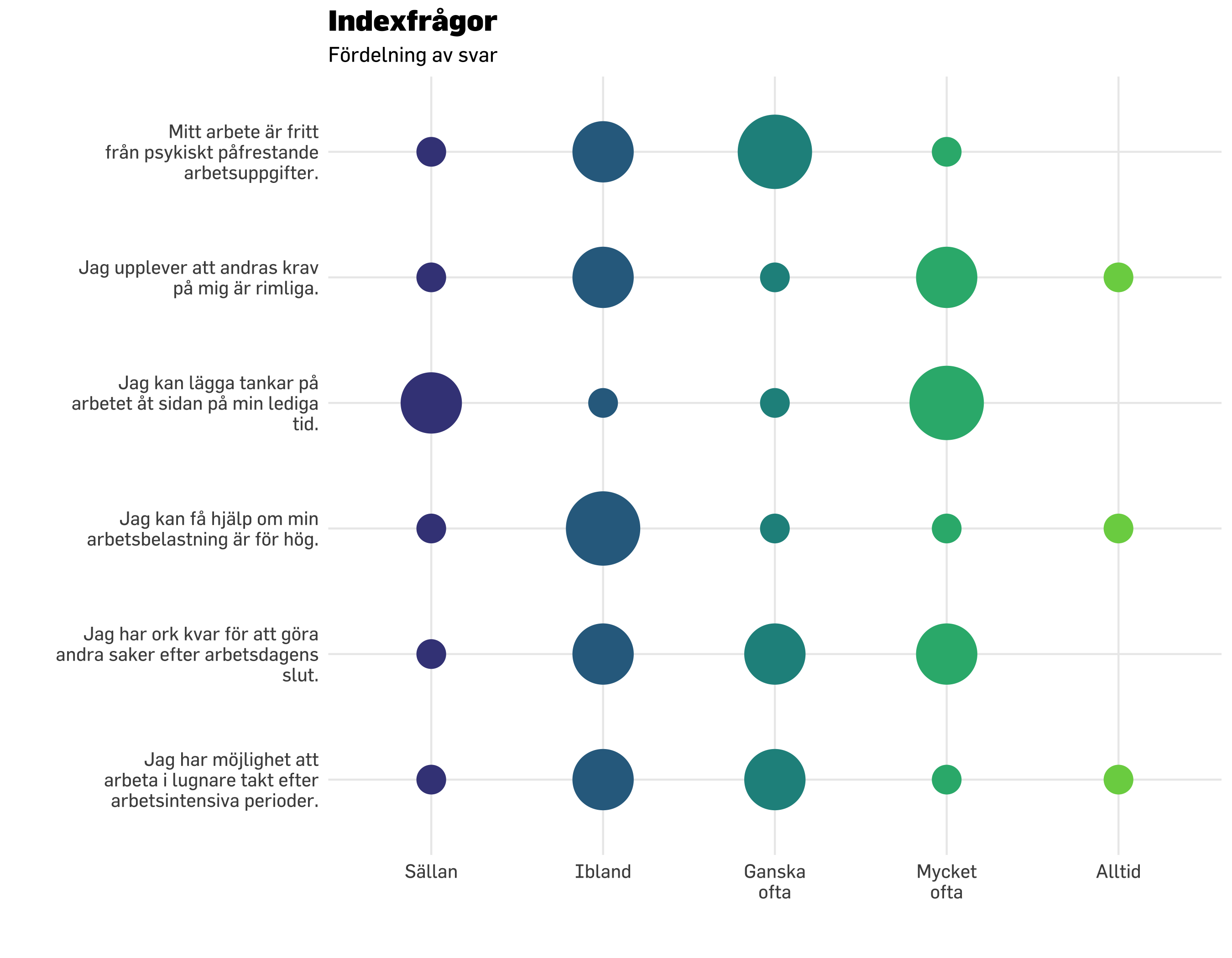
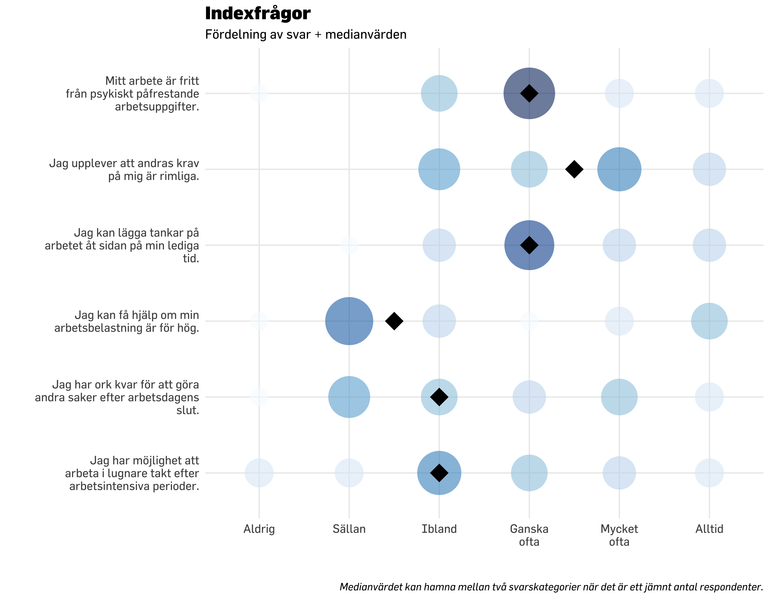
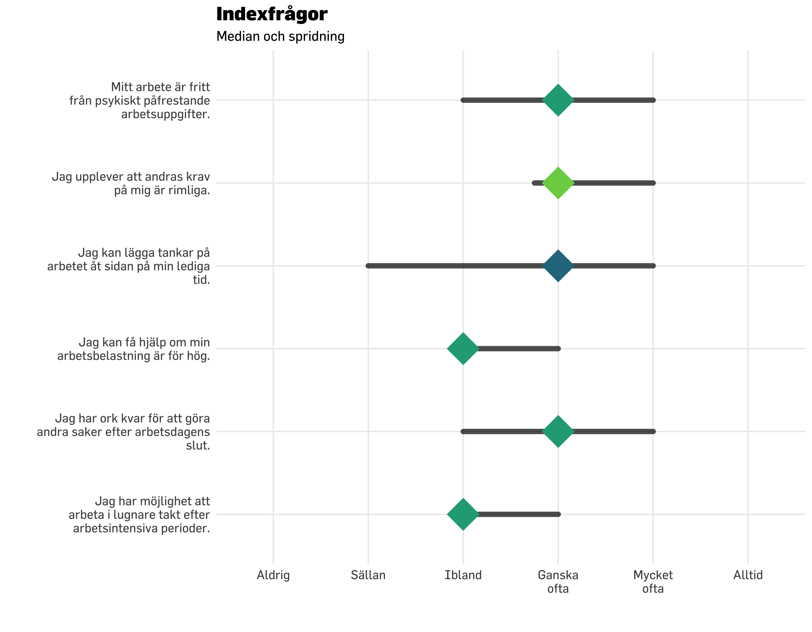
Medianvärdet är det som ligger i mitten när alla värden i gruppen ställs på rad från lågt till högt. Vi börjar med att titta på föregående visualisering “i bakgrunden” och lägga över median-värdet.
Code
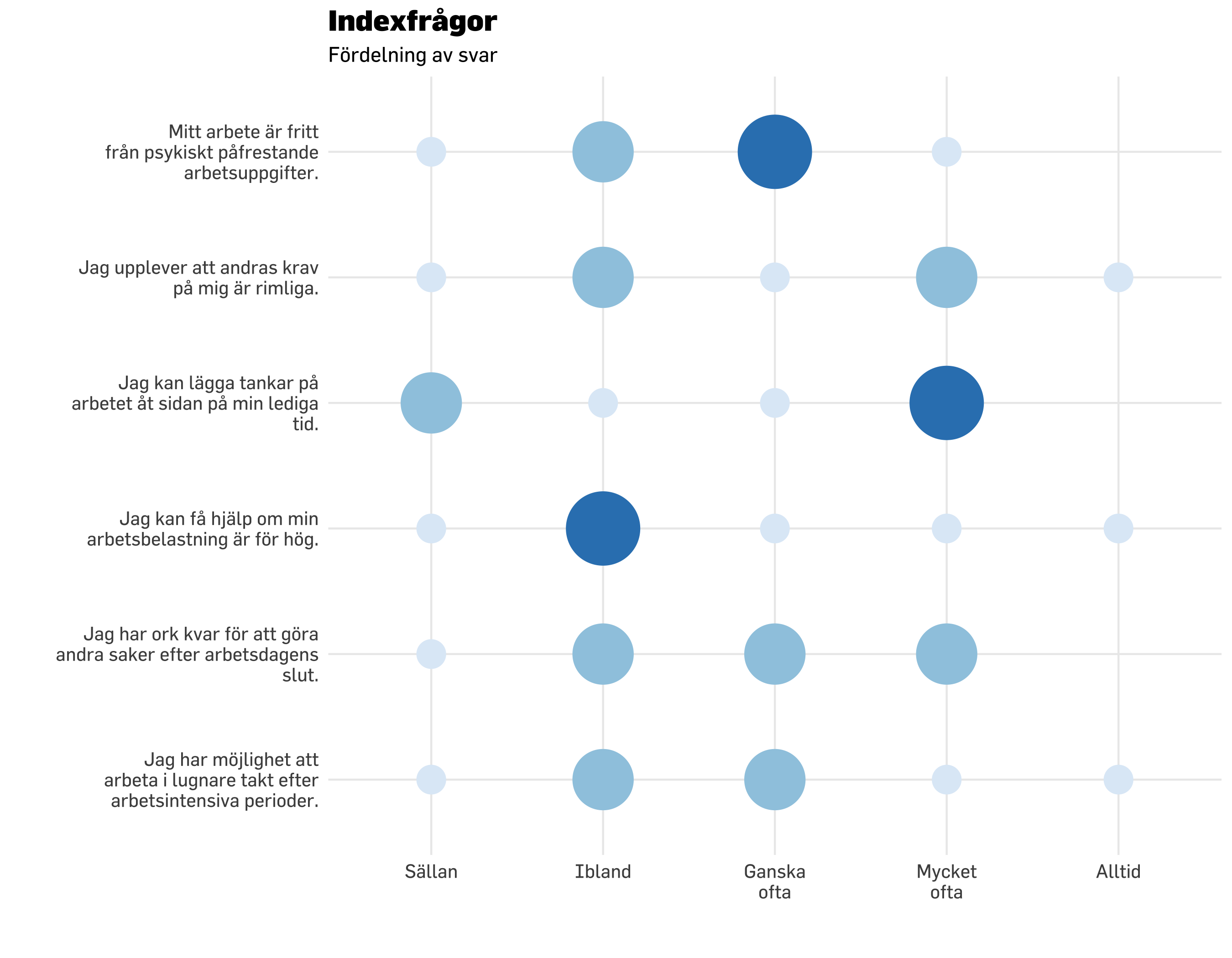
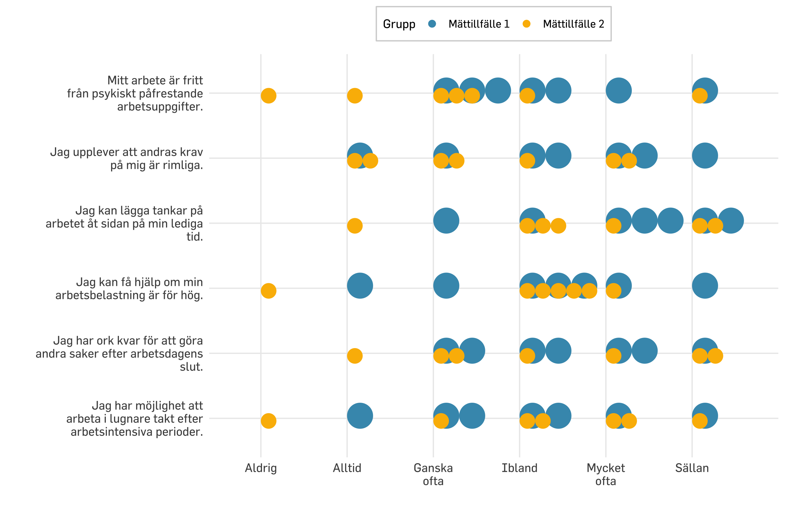
df.plot20 %>% dplyr::count(item, svarskategori) %>%mutate(nFactor =factor(n)) %>%mutate(svarskategori =fct_rev(svarskategori)) %>%ggplot() +geom_point(aes(x = svarskategori, y = item, size = n *1.5, color = nFactor),shape =16,alpha =0.6 ) +geom_point(data = modeResponses,aes(x = medians,y = item),color ="black",size =7,shape =18) +scale_size_continuous(range =c(7, 20), # set minimum and maximum point sizeguide ="none" ) +# remove legend for size aesthetic### theming, colors, fonts, etc belowtheme_minimal() +theme_prevent() +scale_color_brewer(guide ="none" ) +labs(title ="Indexfrågor",subtitle ="Fördelning av svar + medianvärden",caption ="Medianvärdet kan hamna mellan två svarskategorier när det är ett jämnt antal respondenter.",y ="",x ="" ) +scale_y_discrete(labels =~ stringr::str_wrap(.x, width =30)) +scale_x_discrete(labels =~ stringr::str_wrap(.x, width =8))
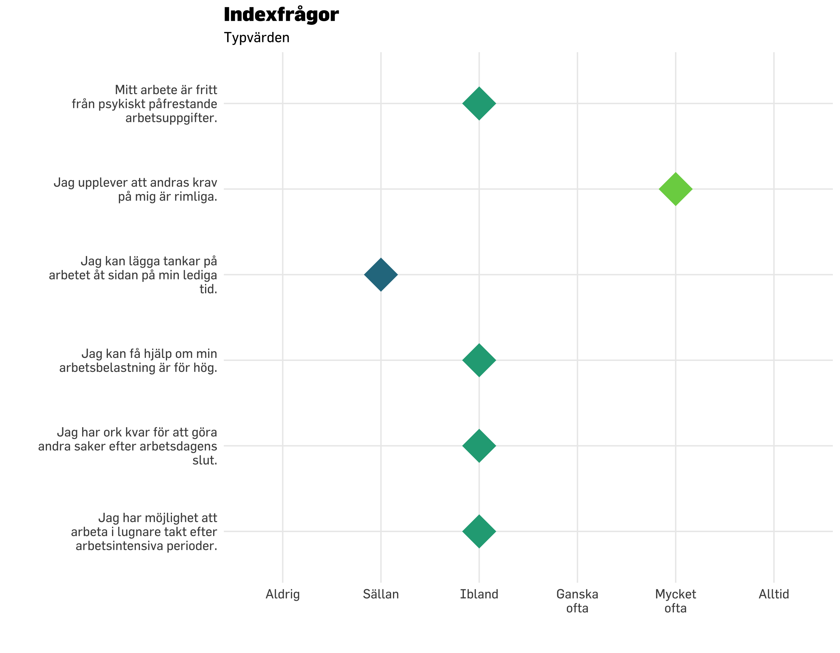
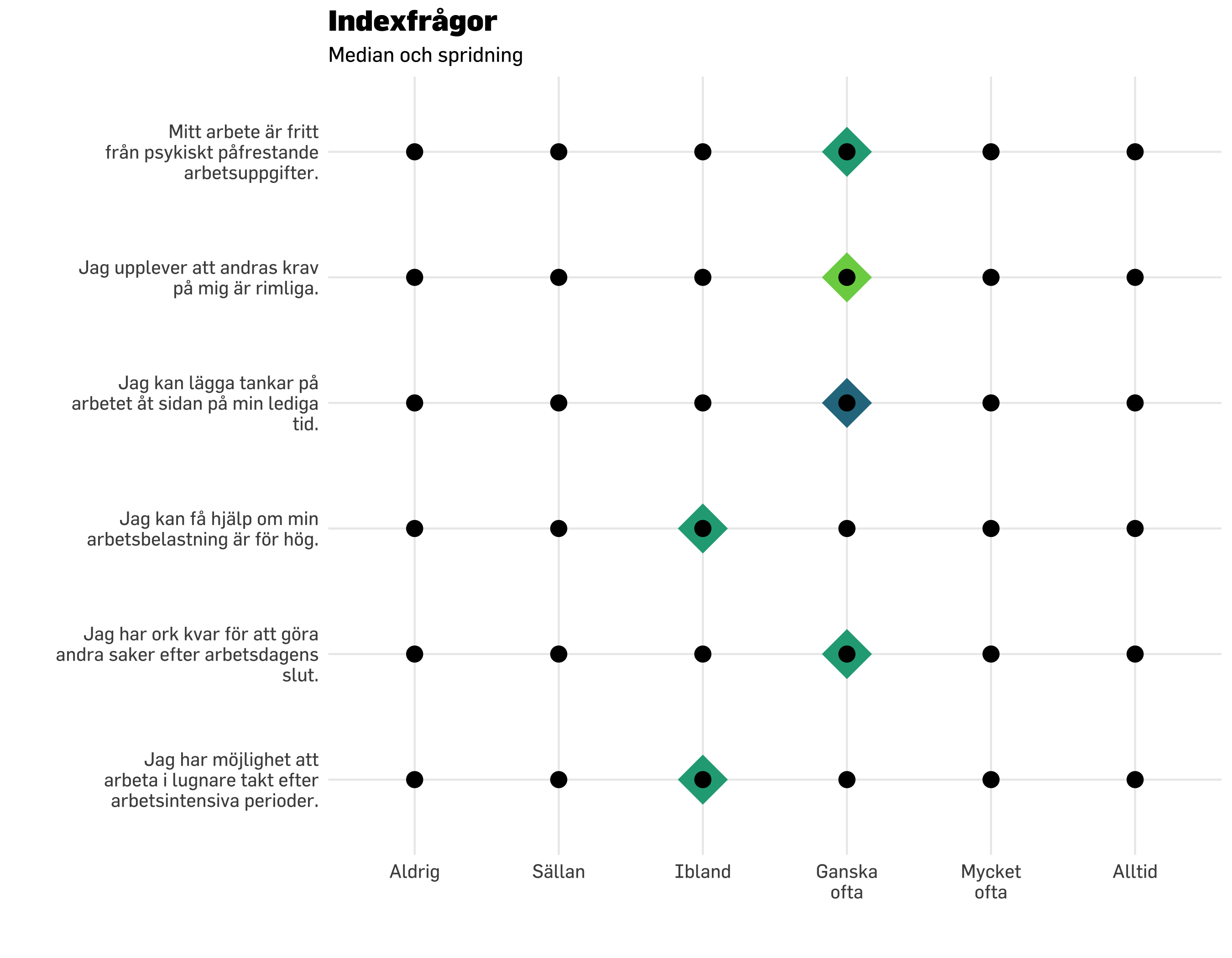
Typvärdet är det vanligast förekommande svaret på en fråga.
Code
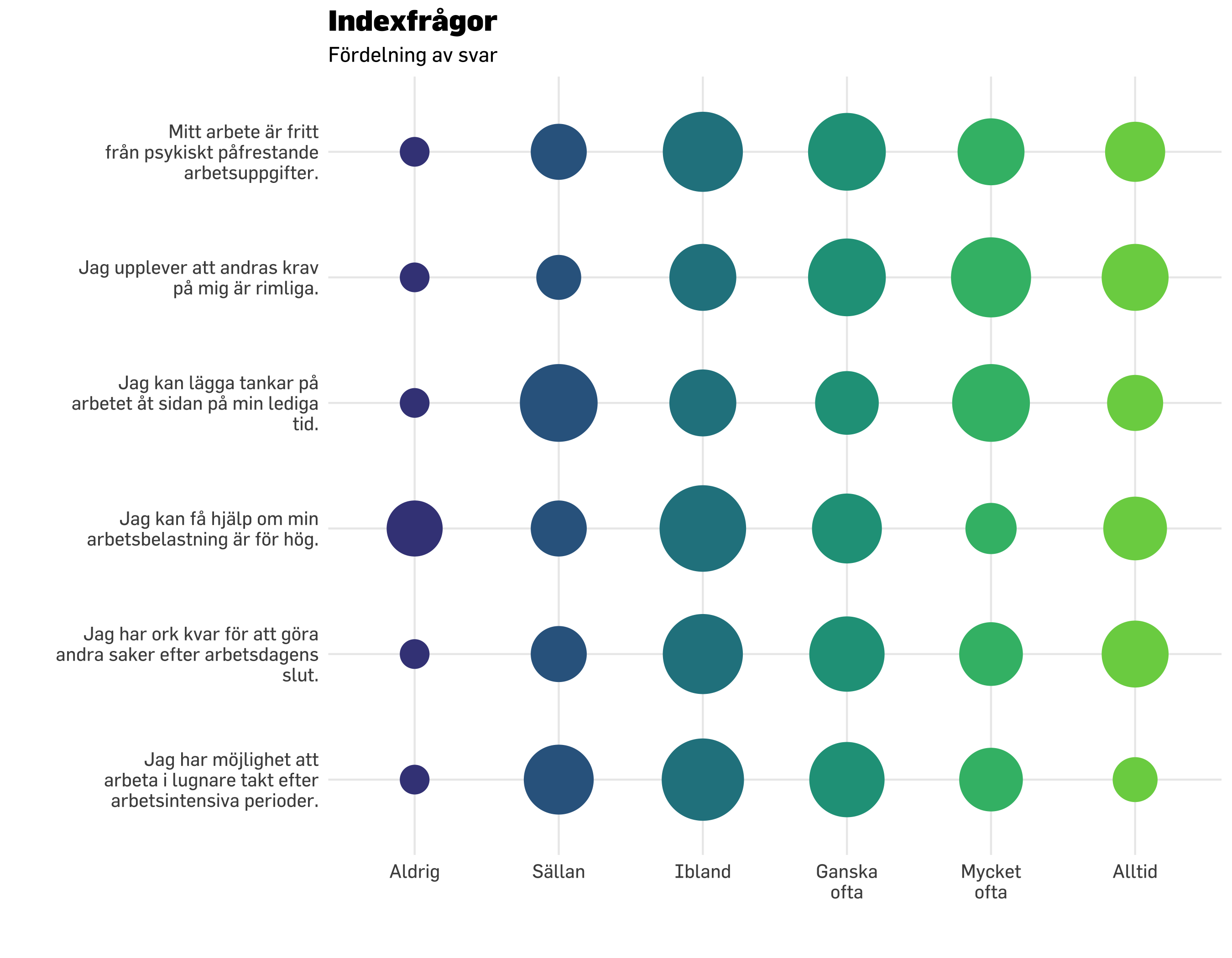
df.plot20 %>% dplyr::count(item, svarskategori) %>%mutate(nFactor =factor(n)) %>%mutate(svarskategori =fct_rev(svarskategori)) %>%ggplot() +geom_point(aes(x = svarskategori, y = item, size = n *1.5, color = nFactor),shape =16,alpha =0.6 ) +geom_point(data = modeResponses,aes(x = modes,y = item),color ="black",size =7,shape =18) +scale_size_continuous(range =c(7, 20), # set minimum and maximum point sizeguide ="none" ) +# remove legend for size aesthetic### theming, colors, fonts, etc belowtheme_minimal() +theme_prevent() +scale_color_brewer(guide ="none" ) +labs(title ="Indexfrågor",subtitle ="Fördelning av svar + typvärden",y ="",x ="" ) +scale_y_discrete(labels =~ stringr::str_wrap(.x, width =30)) +scale_x_discrete(labels =~ stringr::str_wrap(.x, width =8))
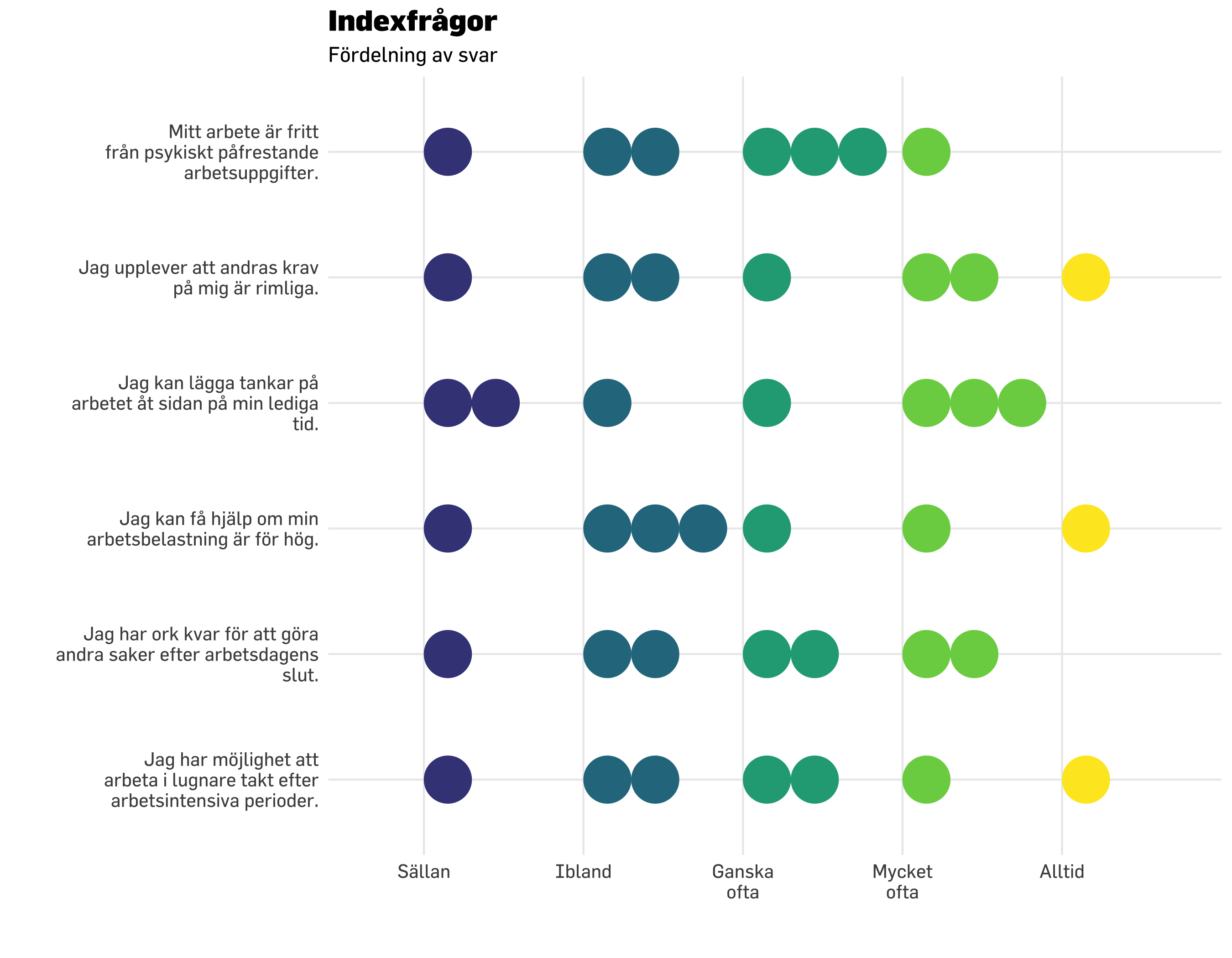
Vi använder interkvartilt omfång (interquartile range, IQR), vilket är avståndet mellan 25:e och 75:e percentilen. Med mindre sampel är dock detta mindre användbart. Vi tittar på sampelstorlek 20, med “bollformade” figurer i bakgrunden för att visa den faktiska spridningen samtidigt.
Vi använder interkvartilt omfång (interquartile range, IQR), vilket är avståndet mellan 25:e och 75:e percentilen. Med mindre sampel är dock detta mindre användbart. Vi tittar på sampelstorlek 20, med “bollformade” figurer i bakgrunden för att visa den faktiska spridningen samtidigt.
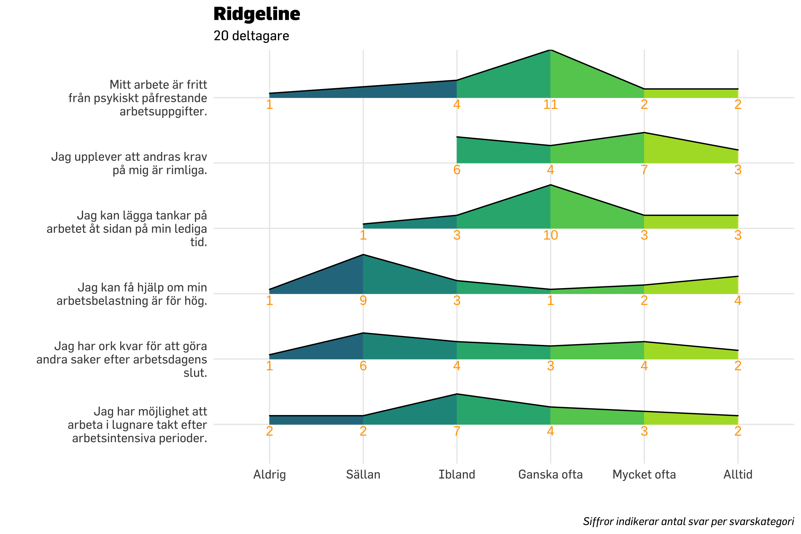
Det blir tyvärr inte bra när vi har såpass få deltagare i samplet. Median är något mindre dåligt, men typvärdet fungerar inte med så små sampel. Men även median känns inte rättvisade, vilket framgår i figuren nedan.
Code
df.plot7 %>% dplyr::count(item, svarskategori) %>%mutate(nFactor =factor(n)) %>%mutate(svarskategori =fct_rev(svarskategori)) %>%ggplot() +geom_point(aes(x = svarskategori, y = item, size = n *1.5, color = nFactor),shape =16,alpha =0.6 ) +geom_point(data = modeResponses7,aes(x = medians,y = item),color ="black",size =7,shape =18) +scale_size_continuous(range =c(7, 20), # set minimum and maximum point sizeguide ="none" ) +# remove legend for size aesthetic### theming, colors, fonts, etc belowtheme_minimal() +theme_prevent() +scale_color_brewer(guide ="none" ) +labs(title ="Indexfrågor",subtitle ="Fördelning av svar + medianvärden",caption ="Medianvärdet kan hamna mellan två svarskategorier när det är ett jämnt antal respondenter.",y ="",x ="" ) +scale_y_discrete(labels =~ stringr::str_wrap(.x, width =30)) +scale_x_discrete(labels =~ stringr::str_wrap(.x, width =8))
14.5.5 stat_dots
denna borde också kunna användas för pre/post, genom att ha två layers med stat_dots för de olika mättillfällena? Och använda position_nudge för att lägga dem ovan/under y-linjen.
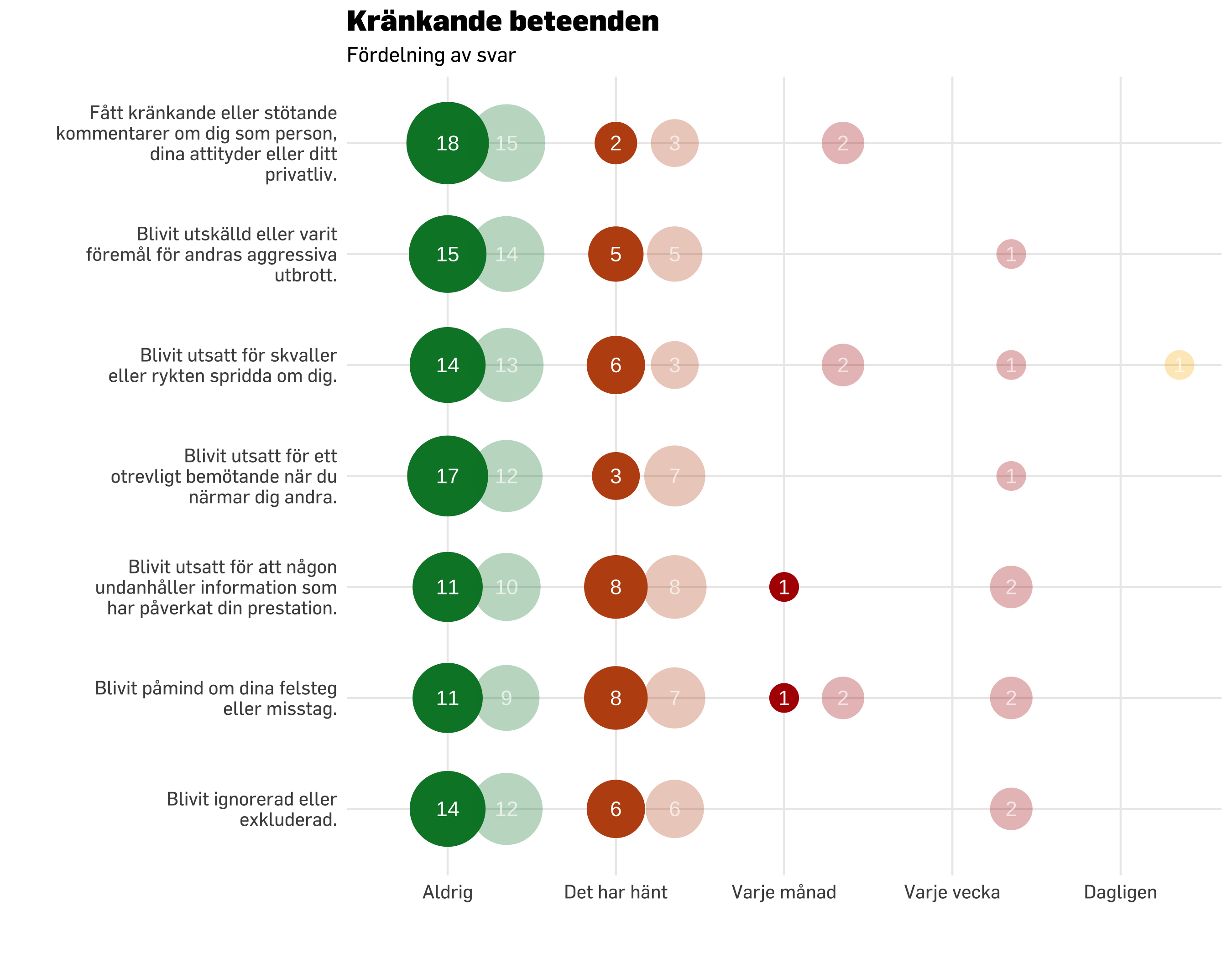
# read data again for negative acts questions, "krbet"df.krbet <-read.spss(spssDatafil, to.data.frame =TRUE) %>%select(starts_with("q0012")) %>%na.omit()# krbet itemlabelskrbet.itemlabels <-read_excel("../data/Itemlabels.xlsx") %>%filter(str_detect(itemnr, pattern ="kb")) %>%select(!Dimension)names(df.krbet) <- krbet.itemlabels$itemnrdf.plot.krbet20 <- df.krbet %>%slice_sample(n =20) %>%pivot_longer(everything()) %>%# we need long format for ggplotrename(itemnr = name,svarskategori = value ) %>%left_join(krbet.itemlabels, by ="itemnr") %>%# get item descriptions as a variable in the dfadd_column(group ="Mättillfälle 1")df.plot.krbet20b <- df.krbet %>%slice_sample(n =20) %>%pivot_longer(everything()) %>%# we need long format for ggplotrename(itemnr = name,svarskategori = value ) %>%left_join(krbet.itemlabels, by ="itemnr") %>%# get item descriptions as a variable in the dfadd_column(group ="Mättillfälle 2")df.krbetComp <-rbind(df.plot.krbet20,df.plot.krbet20b)df.plot.krbet7 <- df.krbet %>%slice_sample(n =7) %>%pivot_longer(everything()) %>%# we need long format for ggplotrename(itemnr = name,svarskategori = value ) %>%left_join(krbet.itemlabels, by ="itemnr") %>%# get item descriptions as a variable in the dfadd_column(group ="Mättillfälle 1")df.plot.krbet40 <- df.krbet %>%slice_sample(n =40) %>%pivot_longer(everything()) %>%# we need long format for ggplotrename(itemnr = name,svarskategori = value ) %>%left_join(krbet.itemlabels, by ="itemnr") %>%# get item descriptions as a variable in the dfadd_column(group ="Mättillfälle 1")krbet.svarskategorier <-c("Aldrig","Det har hänt","Varje månad","Varje vecka","Dagligen")