I recently needed to do a power analysis for a longitudinal study, and since I always document my explorative work in a Quarto file it seemed reasonable to take a few minutes to share my experiences.
The starting point for me was the “Basic example” made by the author of the powerlmm package.
You may need to install the package from the GitHub website:
I made some changes in the example regarding time points, clusters and icc’s. Below is a test run for one combination of parameter settings.
Code
# dropout per treatment groupd<-per_treatment(control =dropout_weibull(0.25, 1), treatment =dropout_weibull(0.25, 1))# Setup designp<-study_parameters(n1 =5, # time points n2 =10, # subjects per cluster n3 =4, # clusters per treatment arm icc_pre_subject =0.5, icc_pre_cluster =0.2, icc_slope =0.05, var_ratio =0.02, dropout =d, cohend =-0.8)# PowerpowerAnalysis<-get_power(p)powerAnalysis$power
[1] 0.7626795
1 Creating a function
We want to be able to vary some of the parameters and compare the resulting power analysis output.
For this example, we will create a function that allows us to vary three of the input parameters:
the number of participants per cluster
attrition/dropout rate
effect size
Code
powerFunc<-function(samplesize=15, dropoutrate=0.25, effectsize=-0.8){d<-per_treatment( control =dropout_weibull(dropoutrate, 1), treatment =dropout_weibull(dropoutrate, 1))p<-study_parameters( n1 =5, # time points n2 =samplesize, # subjects per cluster n3 =4, # clusters per treatment arm icc_pre_subject =0.5, icc_pre_cluster =0.2, icc_slope =0.05, var_ratio =0.02, dropout =d, cohend =effectsize)paout<-get_power(p)return(paout$power)}
Let’s test the function.
Code
powerFunc()
[1] 0.8937192
2 Specifying parameter variations
Next, we will define variables with the parameter variations we want to look at.
Code
# set sample sizessampleSizes<-c(10, 12, 14, 16, 18, 20)# set dropout ratesdropoutRates<-c(0.20, 0.25, 0.30)# set effect sizeseffectSizes<-c(-0.6, -0.7, -0.8)
And now we utilize the magic of expand_grid() to create a dataframe with all combinations of the three variables.
Code
# make a dataframe with all combinationscombinations<-expand_grid(sampleSizes, dropoutRates, effectSizes)
3 Power analysis
We’ll make use of pmap() from the purrr:map() family since we need to input more than two variables.
Code
# use pmap to iterate over all combinationspowerList<-pmap(list(combinations$sampleSizes,combinations$dropoutRates,combinations$effectSizes),powerFunc)%>%# set readable names for each output list object, to later separate into variablesset_names(paste0(combinations$sampleSizes, "_",combinations$dropoutRates, "_",combinations$effectSizes))
The names we set at the end of the chunk above will help us to create separate variables next.
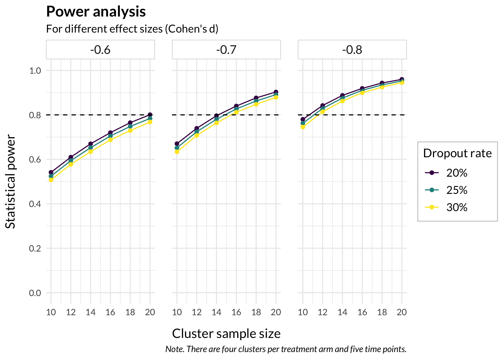
df.power%>%mutate(dropoutrate =factor(dropoutrate, labels =c("20%","25%","30%")), effectsize =fct_rev(factor(effectsize)))%>%ggplot(aes( x =samplesize, y =power, color =dropoutrate, group =dropoutrate))+geom_point()+geom_line()+scale_x_continuous(breaks =sampleSizes)+scale_y_continuous( limits =c(0, 1), breaks =c(0, 0.2, 0.4, 0.6, 0.8, 1))+labs( x ="Cluster sample size", y ="Statistical power", title ="Power analysis", subtitle ="For different effect sizes (Cohen's d)", caption ="Note. There are four clusters per treatment arm and five time points.")+theme_minimal( base_family ="Lato", base_size =14)+facet_wrap(~effectsize)+geom_hline( yintercept =0.8, linetype =2)+scale_color_viridis_d('Dropout rate')+theme_rise()
---title: "Power analysis for multilevel models"subtitle: "Using powerlmm and pmap() with ggplot() to visualize variations of parameter settings"author: name: 'Magnus Johansson' affiliation: 'RISE Research Institutes of Sweden' affiliation-url: 'https://ri.se/shic' orcid: '0000-0003-1669-592X'date: last-modifieddate-format: isogoogle-scholar: truecitation: type: 'webpage'format: html: css: styles.cssexecute: cache: false warning: false message: falseeditor_options: chunk_output_type: console---I recently needed to do a power analysis for a longitudinal study, and since I always document my explorative work in a Quarto file it seemed reasonable to take a few minutes to share my experiences.The starting point for me was the ["Basic example"](https://rpsychologist.com/introducing-powerlmm#a-basic-example) made by the author of the `powerlmm` package.You may need to install the package from the GitHub website:``` rdevtools::install_github("rpsychologist/powerlmm")``````{r}#| code-fold: truelibrary(powerlmm)library(tidyverse)# define ggplot themetheme_rise <-function(fontfamily ="Lato", axissize =13, titlesize =15,margins =12, axisface ="plain", stripsize =12,panelDist =0.6, legendSize =11, legendTsize =12) {theme_minimal() +theme(text =element_text(family = fontfamily),axis.title.x =element_text(margin =margin(t = margins),size = axissize ),axis.title.y =element_text(margin =margin(r = margins),size = axissize ),plot.title =element_text(face ="bold",size = titlesize ),axis.title =element_text(face = axisface ),plot.caption =element_text(face ="italic" ),legend.text =element_text(family = fontfamily, size = legendSize),legend.title =element_text(family = fontfamily, size = legendTsize),legend.background =element_rect(color ="lightgrey"),strip.text =element_text(size = stripsize),strip.background =element_rect(color ="lightgrey"),panel.spacing =unit(panelDist, "cm", data =NULL) )}```I made some changes in the example regarding time points, clusters and icc's. Below is a test run for one combination of parameter settings.```{r}# dropout per treatment groupd <-per_treatment(control =dropout_weibull(0.25, 1),treatment =dropout_weibull(0.25, 1))# Setup designp <-study_parameters(n1 =5, # time pointsn2 =10, # subjects per clustern3 =4, # clusters per treatment armicc_pre_subject =0.5,icc_pre_cluster =0.2,icc_slope =0.05,var_ratio =0.02,dropout = d,cohend =-0.8)# PowerpowerAnalysis <-get_power(p)powerAnalysis$power```## Creating a functionWe want to be able to vary some of the parameters and compare the resulting power analysis output.For this example, we will create a function that allows us to vary three of the input parameters: - the number of participants per cluster- attrition/dropout rate- effect size```{r}powerFunc <-function(samplesize =15, dropoutrate =0.25, effectsize =-0.8) { d <-per_treatment(control =dropout_weibull(dropoutrate, 1),treatment =dropout_weibull(dropoutrate, 1) ) p <-study_parameters(n1 =5, # time pointsn2 = samplesize, # subjects per clustern3 =4, # clusters per treatment armicc_pre_subject =0.5,icc_pre_cluster =0.2,icc_slope =0.05,var_ratio =0.02,dropout = d,cohend = effectsize ) paout <-get_power(p)return(paout$power)}```Let's test the function.```{r}powerFunc()```## Specifying parameter variationsNext, we will define variables with the parameter variations we want to look at.```{r}# set sample sizessampleSizes <-c(10, 12, 14, 16, 18, 20)# set dropout ratesdropoutRates <-c(0.20, 0.25, 0.30)# set effect sizeseffectSizes <-c(-0.6, -0.7, -0.8)```And now we utilize the magic of `expand_grid()` to create a dataframe with all combinations of the three variables.```{r}# make a dataframe with all combinationscombinations <-expand_grid(sampleSizes, dropoutRates, effectSizes)```## Power analysisWe'll make use of `pmap()` from the `purrr:map()` family since we need to input more than two variables.```{r}# use pmap to iterate over all combinationspowerList <-pmap(list( combinations$sampleSizes, combinations$dropoutRates, combinations$effectSizes ), powerFunc) %>%# set readable names for each output list object, to later separate into variablesset_names(paste0( combinations$sampleSizes, "_", combinations$dropoutRates, "_", combinations$effectSizes ))```The names we set at the end of the chunk above will help us to create separate variables next.```{r}# combine into dataframe for visualizationdf.power <- powerList %>%bind_rows() %>%t() %>%as.data.frame() %>%rownames_to_column("split_this") %>%rename(power = V1) %>%separate(split_this,into =c("samplesize", "dropoutrate", "effectsize"),sep ="_" ) %>%mutate(across(everything(), ~as.numeric(.x)))glimpse(df.power)```## Visualization```{r}df.power %>%mutate(dropoutrate =factor(dropoutrate,labels =c("20%","25%","30%")),effectsize =fct_rev(factor(effectsize))) %>%ggplot(aes(x = samplesize,y = power,color = dropoutrate,group = dropoutrate )) +geom_point() +geom_line() +scale_x_continuous(breaks = sampleSizes) +scale_y_continuous(limits =c(0, 1),breaks =c(0, 0.2, 0.4, 0.6, 0.8, 1) ) +labs(x ="Cluster sample size",y ="Statistical power",title ="Power analysis",subtitle ="For different effect sizes (Cohen's d)",caption ="Note. There are four clusters per treatment arm and five time points." ) +theme_minimal(base_family ="Lato",base_size =14 ) +facet_wrap(~effectsize) +geom_hline(yintercept =0.8,linetype =2 ) +scale_color_viridis_d('Dropout rate') +theme_rise()```I added a reference line for power = 0.80.